Project Brief

The Problem
Picture this: you’re in Montana and there’s nothing you want more than a batch of your favorite apples from a specific orchard in Washington State. Usually, getting them would be a shot in the dark unless you happened to know someone heading that way who’d grab them for you, maybe making a bit of extra cash for the effort. Right now, folks turn to platforms like Craigslist for this kind of favor. But what if I took this idea and polished it up a bit?

The Solution
Think about a platform tailor-made to make these kinds of exchanges a breeze, backed up with solid features like insurance and a user rating system to keep things honest and trustworthy. This kind of space could totally change the game for peer-to-peer swaps, making them not just safer and more dependable, but also a lot easier. It’s all about zooming in on what users really need and making a big difference in how they get things done. It’s a fresh, innovative approach that’s all about shaking things up and putting users first.

Background
DropTrip is a fresh-faced startup on a mission to shake up the delivery world. They’re cooking up an app that lets folks make a little extra cash by dropping off packages while they’re already out on a road trip. It’s all about blending the handiness of ride-sharing with the ease of package delivery services.

Objective
At the core of this project is designing an app centered around the user experience, ensuring that individuals can easily undertake delivery tasks, monitor their routes, and confirm deliveries seamlessly. The goal is to create an intuitive, transparent, and secure app for all users. Although this presentation doesn’t showcase the app’s final screens in their entirety, it effectively highlights the extensive research, meticulous design outputs, and critical design choices made to enhance the overall user experience of the app.

Target Audience
Droptrip is reaching out to adults who hit the road often and wouldn’t mind making some extra cash along the way. Whether it’s the long-haul trucker or someone gearing up for a leisurely road trip, there’s a spot for everyone.

CONTRIBUTIONS

CO-FOUNDER | UI/UX DESIGN

TOOLS

WIREFRAME: SKETCH

MOCK-UP: SKETCH

PROTOTYPE: ADOBE XD

Market Research

Target Market:

The target market for DropTrip comprises individuals who travel frequently by road and are looking for ways to make extra income. These users range from college students to working professionals who are tech-savvy, likely in the age range of 20-50 years old. Both males and females can equally benefit from this service. Their educational background is varied, but a common thread is understanding and comfort with mobile app usage. Their income would range from low to high, with an emphasis on those looking for supplementary income sources.

What is the Age Distribution


What is the Gender Distribution


Frequency of Long Distance Travel


Comfort with Technology *

* 1: Not comfortable, 5: Very comfortable

Frequency of Using Delivery Services


Competitor Analysis:

Competitors would include other gig-economy apps that provide opportunities for earning on the go. Apps like Uber, Lyft, and Postmates offer similar opportunities but with different services. DropTrip’s unique selling proposition is the combination of travel and delivery, reducing costs for both clients and drivers by utilizing existing travel plans.

Competitor Target User Core Service Unique Selling Points Drawbacks
Uber

Rideshare users, urban dwellers.

Ride-hailing service.

Large network, instant service, dynamic pricing.

No package delivery option, drivers may not travel long distances.

Lyft

Rideshare users, urban dwellers.

Ride-hailing service.

Competitive pricing, and friendly service.

No package delivery option, and fewer cities than Uber.

Postmates

Urban dwellers, busy professionals.

On-demand delivery of food and goods.

A broad range of goods, delivery from any store or restaurant.

Mainly for food and local deliveries, no long-distance package delivery.

Roadie

Those needing package delivery, especially unusual or larger items.

On-the-way delivery service.

Delivers almost anything, including large and unusual items.

Mav not suit regular, small package delivery.

DropTrip

Frequent travelers, those seeking extra income.

Package delivery combined with planned travel.

Utilizes existing travel plans for efficient delivery, the potential for travelers to earn.

Still gaining user trust, new in the market.

Market Needs:

The market need for this service is driven by two factors: the need for affordable and convenient delivery services, and the need for flexible income opportunities. With the rising costs of shipping and courier services, customers are looking for cheaper and more reliable alternatives. On the other hand, individuals are increasingly seeking flexible work that fits into their schedules and allows them to earn extra income.

Pain Point

DropTrip Solution

High cost of shipping and courier services.

DropTrip leverages existing travel plans of drivers, reducing costs for clients.

Inconsistent or unreliable delivery services.

DropTrip’s review and rating system promotes reliable and high-quality service.

Need for flexible income opportunities.

DropTrip offers a platform for individuals to earn extra income while traveling, providing flexible work opportunities.

Lack of direct interaction with service providers.

DropTrip enables peer-to-peer service, allowing clients to connect directly with drivers.

Difficulty in monetizing travel.

DropTrip allows frequent travelers to monetize their existing travel plans by delivering items on their way.

Market Trends:

The gig economy is a significant trend that Droptrip is tapping into. With the rise of remote work and digital nomads, more people are on the move than ever before and may be looking for ways to monetize their travel. Furthermore, there’s an increasing demand for peer-to-peer services that allow people to directly connect with service providers.
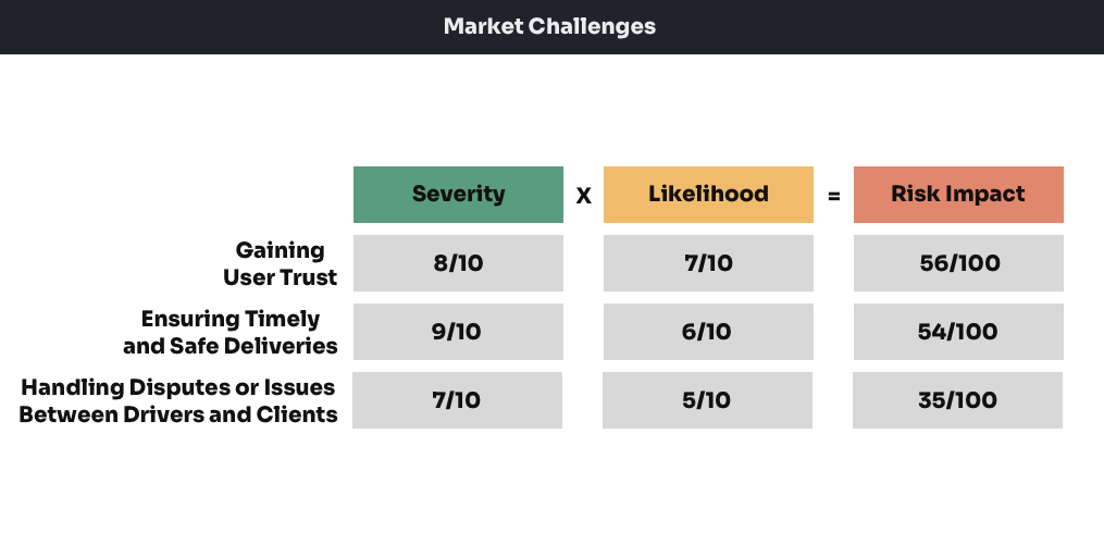
Market Challenges:

Some challenges that might face DropTrip include gaining user trust, ensuring timely and safe deliveries, and handling disputes or issues that arise between drivers and clients. Building a reliable rating and review system can help to establish trust. Also, comprehensive onboarding and support resources can ensure that drivers and clients understand how to use the app effectively and resolve any issues that come up.

User Research (Pre Design)

In this stage, I presented my concept to Droptrip’s identified user groups, which represent a diverse range of needs, habits, and familiarity with technology. These presentations enabled me to test our proposed use cases and initial assumptions against user experiences and interactions.

Surveys and Questionnaires

How often do you travel on long distances road trips?

How comfortable are you using apps while traveling?

Have you used app-based delivery services before?

How interested are you in making extra money while you are traveling?

Are you interested in an app where you earn money delivering packages?

What are your primary concerns when considering using this type of service?

What features would you find most beneficial in an app like this?

User Interviews

Interview 1 – College Student (Emily)

Emily is a 22-year-old college student who often drives home to visit friends in other cities.

How often do you travel by road? I drive home from school at least once a month. It’s about a 5-hour drive each way.

Have you ever thought about making money during your travels? Yes. I’ve tried food delivery, but it’s difficult to balance with my class schedule.

What features would you like to see in an app like this? clear, upfront pricing system. I’d also like the ability to choose or reject jobs based on the details provided.

Interview 2 – Remote Worker (David)

David is a 35-year-old remote worker who enjoys taking road trips in his downtime.

How frequently do you take road trips? I usually hit the road every two weeks. It’s a way to escape the routine, and working remotely gives me that flexibility.

Would you consider delivering packages to earn extra money? Sure, why not? It’s not out of my way and it would help fund my travels.

What are your main concerns regarding delivering packages? My main concern would be the time commitment. I wouldn’t want it to interrupt my travel plans.

What features would you find useful in an app like this? Real-time tracking and easy communication with the package owner would be helpful. A flexible scheduling feature would also be great.

Interview 3 – Uber Driver (Sophia)

Sophia is a 28-year-old who drives for Uber part-time to make extra money.

How comfortable are you with using apps to earn money? I’m pretty comfortable. I’ve been driving for Uber for a while, and I also sell handmade jewelry on Etsy.

What would encourage you to use an app like this? If the pay was worth it and if it had a strong community of drivers. Good customer support would be important too

What are your main concerns? Dealing with demanding customers or dispute resolution. I’d also want to ensure my vehicle’s wear and tear is taken into account.

What features would you want in this app? A comprehensive rating and review system, for both drivers and clients. Clear guidelines on dispute resolution. Oh, and easy cash-out options.

Interview 4 – Retiree (John)

John is a 60-year-old retiree who enjoys traveling across the country in his RV.

Would you consider delivering packages on your travels? Sure, it would give me something to do and help cover some of my travel expenses.

What concerns would you have? Safety is a big one, especially when picking up and dropping off packages. I wouldn’t want to go into unsafe areas.

What features would you like in the app? Easy to use navigation and clear instructions. Also, 24/7 customer support in case there are any issues during the trip.

Field Studies

Study 1 – College Student (Emily)

For this study, I observed Emily, a 22-year-old college student who frequently drives home to visit friends in other cities.

Travel Routine: Emily travels home from college at least once a month, usually over the weekends or during breaks. Her trips involve a 5-hour drive each way, suggesting a need for a delivery service that can be integrated into her existing travel routine without causing significant disruptions or detours.

Use of Tech During Travel: Emily uses technology heavily, both for her studies and personal life. She uses apps for navigation, entertainment, and communication during her travels. This indicates that she would be receptive to a new app, provided it offers a seamless user experience and clear benefits.

Perception About Deliveries: Emily expresses concerns about the responsibility of handling someone else’s packages, particularly potential damage during transit. She would also worry about safety during pick-ups and deliveries. This suggests the need for the app to provide clear guidelines about liability and safety measures, to alleviate such concerns.

Study 2 – Remote Worker (David)

David, the remote worker who enjoys road trips, was observed during his planning process for a weekend trip.

Preparation for travel: David spends a significant amount of time researching his route, including stops along the way for sightseeing and rest. This indicates the importance of a flexible delivery scheduling feature that won’t interrupt his travel plans.

Use of tech during travel: David uses several travel-related apps for navigation, accommodation, and food recommendations. This suggests that he is comfortable with technology and would likely adopt a new app that integrates seamlessly into his travel routine.

Perception about deliveries: When asked about incorporating package deliveries into his trips, he showed interest but was concerned about the potential detour from his planned route. This suggests the need for the app to indicate the pickup and delivery locations and the possible impact on his original travel plan.

Study 3 – Uber Driver (Sophia)

Sophia, the part-time Uber driver, was observed during her typical day of picking up and dropping off passengers.

Working with the Uber app: Sophia demonstrated comfort and efficiency while using the Uber app, quickly accepting jobs, navigating to locations, and communicating with passengers. This indicates that a similar, user-friendly interface would likely appeal to her in a delivery app.

Assessing job opportunities: Sophia was observed to be selective with the jobs she accepted, considering factors like distance, payout, and location. This suggests the need for detailed information about each delivery job, including package size, pick-up and drop-off locations, and payout.

Dealing with customers: Sophia maintained a professional demeanor while interacting with customers, suggesting she would be comfortable handling pickups and deliveries with package owners.

Study 4 – Retiree (John)

In this field study, I observed John, a 60-year-old retiree who enjoys traveling across the country in his RV.

Planning for Travel: John takes a relaxed approach to travel, with flexibility and spontaneity as his guiding principles. He prefers less crowded routes and enjoys the serenity of nature. This highlights the importance of flexibility in the delivery process for him, allowing him to pick up and deliver packages without significant detours.

Use of Tech During Travel: ohn has a basic level of comfort with technology, primarily using it for navigation and staying in touch with his family. This suggests the need for an intuitive and simple-to-use interface in the app.

Perception About Deliveries: John likes the idea of earning money during his travels, seeing it as a way to offset some of his travel costs. However, his main concern is safety, especially when entering unfamiliar neighborhoods for pick-ups and drop-offs. The app will need to address this concern, possibly through vetting clients or providing safety guidelines and support.

Persona Creation

Informed by comprehensive market research, I crafted detailed user personas that epitomize Droptrip’s core target demographics.

The application’s user base primarily converges into two distinct personas: the shipper, who desires to transport items, and the traveler, who can carry these items on their journey. These personas offer valuable insights into Droptrip’s users’ needs, preferences, and behaviors, forming the foundation for designing an intuitive and user-centric application experience.

Shippers

Sarah Thompson

Profession: E-Commerce Entrepreneur

Age: 30

Gender: Female

Location: San Francisco, California

Education: Bachelor’s degree in Business Administration

Income: $80,000/year

Background: Sarah has been running her online jewelry store for the past 3 years. She is passionate about her business and aims to provide the best customer experience. To manage costs, she has been handling packaging and shipping herself. However, as her business grows, she’s finding it challenging to manage all aspects single-handedly.

Goals: Sarah is eager to expand her business reach nationwide without compromising on her customer experience She wants to partner with a reliable shipping service that can handle her deliveries efficiently, timely, and safely. Sarah is also environmentally conscious and hopes to reduce her business’s carbon footprint. The idea of a shared, economy-based shipping solution appeals to her from both a cost-saving and an eco-friendly perspective.

Pain Points: Sarah’s main challenges include managing shipping costs and delivery times. Traditional courier services are expensive and can significantly cut into her profit margins. Moreover, she finds it hard to keep track of all her shipments. The possibility of losing packages in transit or facing delivery delays negatively affects her customer relationships.

Brian Martinez

Profession: Software Engineer

Age: 35

Gender: Male

Location: Austin, TX

Education: Bachelor’s degree in Computer Science

Income: $110,000/year

Background: Brian is a tech-savvy professional who enjoys the convenience of online shopping. He frequently buys from a range of online platforms, including larger retailers and individual sellers. However, he often struggles with long delivery times and limited shipping options, especially when shopping from small sellers.

Goals: Brian wants a consistent, reliable, and fast shipping experience regardless of the size or location of the seller. He’s intrigued by the concept of an app that could expedite his deliveries by connecting him directly with people who can deliver his packages while on their journey.

Pain Points: His main frustration is long delivery times and lack of shipping options when purchasing from smaller sellers. He’s also experienced a lack of transparency about the package’s location during transit. Brian seeks a solution that can provide faster delivery times, more shipping options, and real-time tracking.

Maria Gonzalez

Profession: Small Business Owner

Age: 45

Gender: Female

Location: New York, New York

Education: Master’s degree in Marketing

Income: $120,000/year

Background: Maria has built a reputation for her boutique bookshop over the past 10 years. Her customers value the rare and vintage books she curates. and her business thrives on repeat customers and word-of-mouth referrals. She often ships books to customers and collectors across the country are always anxious about the condition the books will arrive in.

Goals: Maria’s primary goal is to ensure her books reach her customers in the same condition they left her shop. She’s interested in a shipping service that can handle her books with utmost care and provide assurance that her precious cargo is safe. The idea of having her books delivered by someone who understands their value and can personally ensure their safe delivery is appealing.

Pain Points: Maria has had experiences with traditional couriers where her books were damaged in transit, which led to customer dissatisfaction and financial loss on her part. She’s also found that insurance claims with large courier services can be a long, complicated process. Maria is looking for a more reliable and personal shipping service that understands and respects the value of her products.

Travelers

Jake Wilson

Profession: College Student

Age: 22

Gender: Male

Location: New York, New York

Education: Currently pursuing a Bachelor’s Degree in Computer Science

Income: Part-time job at the campus library, roughly $15,000 per year

Background: Jake is a 22-year-old full-time college student majoring in Computer Science. As suggested by my user research, younger demographics, sun as students, show an interest in making extra money during their travels. His family lives in another state and he often drives back home during holidays and semester breaks. Jake is tech-savvy, as indicated by the comfort with technology expressed by my research respondents.

Goals: Jake’s main goal is to offset his travel costs, such as gas and food during his long drives home. This goal aligns with our research findings where respondents expressed high interest in earning extra money during their travels.

Pain Points: Jake’s budget is limited and finding time to work around his studies can be a challenge. This reflects the need for flexible work opportunities that I identified in my research. He also shares concerns about the safety and potential liability of packages, which were common themes in my research.

Martha Davis

Profession: Adventurous Retiree

Age: 67

Gender: Female

Location: Phoenix, Arizona

Education: Bachelor’s Degree in History

Income: Retirement funds, roughly $40,000 per year.

Background: Martha is a 67-year-old retiree who loves traveling across the country in her RV. She enjoys meeting new people and exploring new places, as suggested by the portion of my research respondents who frequently travel long distances.

Goals: Martha is enjoying her retirement and plans on seeing as much of the country as she can. She is interested in delivering packages for extra money, reflecting the interest in my service found in my research.

Pain Points: Safety is a major concern for Martha, aligning with the most common concern identified in our research. She also has concerns about the use of technology, reflecting the portion of my research respondents who expressed lower comfort with technology.

Liam Clark

Profession: Freelance Writer

Age: 30

Gender: Male

Location: Austin, Texas

Education: Bachelor’s Degree in English Literature

Income: Varies, averages $60,000 per year

Background: Liam is a 30-year-old freelance writer who enjoys working from different locations and often travels for inspiration. He represents the demographics of my research respondents who expressed high comfort with technology and frequent travel.

Goals: Liam wants to keep his travels as affordable as possible, reflecting the goal of our research respondents who want to earn money during travel. He is also interested in using an app to facilitate package delivery, aligning with the interest shown in Droptrip’s service

Pain Points: Liam’s major pain points are managing his travel costs and balancing work commitments with potential delivery deadlines, reflecting the challenges of scheduling and time management which were common in my research.

User Journey Mapping

I meticulously crafted comprehensive user journey maps that outline the end-to-end experience for both shippers and travelers within the app. These user journey maps encompass every critical step, starting from accepting a delivery task and culminating in a successful delivery.

By developing these user journey maps, I gained valuable insights into the needs, pain points, and expectations of both shippers and travelers. This holistic understanding of their journeys enables me to design a seamless and intuitive user experience that caters to their specific requirements. These user journey maps serve as a guiding framework, ensuring that every stage of the app aligns with user expectations and contributes to a positive overall experience.

Shipper

When mapping out the user journey for the shipper, I identified several crucial screens to include:

The journey starts the moment you hit the Sign-Up or Log-In screen, offering you the choice to either create a new account or log into an existing one. At this important crossroads, you decide to identify as a “shipper,” setting the stage for the specialized features and user experiences you’ll encounter within the app. After entering your email and password, you complete the initial setup, essentially unlocking the gateway to your personalized shipping world. You’re then greeted with a brief tutorial or welcome message that highlights key functionalities, giving you a quick orientation before you dive in. You’re now ready to explore the app’s main hub, designed specifically to cater to the unique needs and preferences of shippers like you.

After setting up an account, you’re guided to the Profile Setup stage to add the finishing touches to your personalized shipping experience. Here, you get to fill in key details like where you’re located, your go-to shipping routes, and the kinds of items you usually ship. This isn’t just busywork; the info you provide helps the app better match you with travelers and customizes your whole shipping journey, making it smoother and more in tune with what you actually need. Plus, the data you input here sets the stage for future feature recommendations and even potential discounts, giving you more control and value over time. Overall, it’s a critical step that shapes how effectively the platform serves you.

Once you’re logged in, it’s super easy to head over to the “Post a Job” page to get your delivery sorted. This part of the app walks you through all the important details, making it a breeze to fill out. You’ll plug in info like where the package is going, what it’s like—think size and weight—when it needs to get there, and how much you’re willing to pay someone to take it. Everything’s laid out clearly, so you know exactly what you’re setting up, which takes the guesswork out for travelers who might be interested. All in all, the layout’s straightforward but thorough, letting you post your delivery job quickly without skimping on the details. Plus, the system even double-checks your entries, giving you peace of mind that everything is in order before you finalize the post.

After you’ve filled out the “Post a Job” form, you land on a “Review and Confirm” screen. Think of this as your last chance to double-check all the job details you’ve just entered. It’s laid out so you can easily spot any mistakes or stuff you might’ve skipped, preventing mix-ups down the road. Once you’re sure that everything looks good—from where the package is coming from and going to, to what exactly it is—you hit that “Confirm” button. Doing so makes your delivery job go live, showing it to all the available travelers in real-time. This step is basically your final thumbs-up, making sure you and your future traveler are totally in sync for a smooth delivery experience. It adds a layer of confidence, letting you proceed knowing that all systems are go.

Once the delivery job is up and running, the shipper gets to wear the decision-maker’s hat, as interested travelers start throwing their hats into the ring. This stage is all about giving shippers options and control. They can click through to view each traveler’s profile, read up on past performance ratings, and check out reviews from other shippers. All these details help the shipper make a savvy choice, picking a traveler who not only has the right skills but also vibes with their own comfort level and needs. Essentially, this step lets the shipper choose someone they genuinely trust to take care of their delivery, making it more of a partnership than just a transaction.

After picking the right traveler, the shipper can start chatting to sort out important details—like the pick-up time and any special package care. The app acts as a safe space for these conversations, ensuring that personal info like phone numbers stays private. You can message directly within the app, eliminating the need to swap contact details and keeping everything secure. This setup allows the shipper to clear up any last-minute questions, fine-tune the pick-up time, or share special instructions about the package. With a user-friendly chat feature, it’s easy to keep the lines of communication open, helping both the shipper and the traveler get on the same page. This open dialogue contributes to a more transparent and efficient delivery process, setting the stage for a smooth and reliable experience.

When the shipper and traveler meet up at the agreed time and place, they hand over the package to each other. This face-to-face moment is really the heart of the shipping process, making the trust between both parties more concrete. To mark this milestone in the app, the shipper hits a ‘Confirm Pick-Up’ button, kicking off the app’s real-time tracking. Doing this creates a digital record of the package changing hands and helps everyone stay accountable, since both the shipper and the traveler can now follow the package’s journey. Making the pick-up confirmation straightforward and easy means both the shipper and the traveler can feel more secure and in the loop throughout the whole shipping experience.

As the package hits the road, the shipper can follow its journey live through the app’s tracking feature. It’s not just about seeing where the package is on a map; the app also logs key moments like when the package leaves its starting point or reaches certain checkpoints or its final stop. This tracking isn’t just for show—it actually keeps the lines of communication open between you and the traveler. Should any questions or curveballs come up while the package is en route, a quick chat with the traveler is just a tap away in the app. This setup blends real-time tracking with instant messaging to give the shipper peace of mind, a sense of control, and a genuinely engaging experience from start to finish.

The moment your package reaches its final destination, you’ll get an instant heads-up from the app. But it’s not just a notification—you’ll often also get some digital proof, like a photo of your package safely delivered or even a signature from the recipient, right in the app. These extra steps are all about building trust and making sure everything’s transparent. Next, it’s up to you to give the delivery the green light in the app. Once you do, the payment that’s been sitting in escrow gets sent over to the traveler, wrapping up the whole deal. This step-by-step approach keeps everyone on the same page, making the delivery process secure, reliable, and satisfying for both sides.

Right after your package is safely delivered and the traveler gets paid, you’ll get a nudge from the app to leave a rating and a review. With just a few taps, you can give star ratings and jot down some thoughts about how things went. This isn’t just a nice-to-have; it’s key for keeping the community trustworthy and legit. Your feedback helps other shippers know what they’re getting into when they pick a traveler. Plus, it keeps travelers on their toes, knowing that good reviews can make or break their chances at future gigs. In short, this whole feedback system doesn’t just keep quality up—it actually helps make the whole platform better over time.

By carefully crafting each screen in the journey as a shipper, I’ve aimed to make the whole experience feel smooth and complete. So whether they’re signing up, posting a job, chatting with travelers, or tweaking their account settings, they will find it all intuitive and easy to handle right on the app. This design approach makes it simple for them to focus on what matters most: getting their items shipped efficiently and reliably.

Traveler

In mapping out the user journey for the traveler, I identified key screens that optimize their experience:

Your adventure as a traveler starts the moment you hit the Sign-Up or Log-In screen. Here, you’ve got two options: either start fresh with a new account or jump back into an existing one. At this key moment, you decide to roll as a “traveler,” which gears the app to show you features just for folks like you. After popping in your email and password, you’re good to go and ready to spruce up your profile. This step is your ticket to a personalized journey, giving you access to all the cool traveler-specific features the app has to offer. Now, you’re all set to dive into the app, explore its functionalities, and start picking up some shipping tasks. And, as you settle in, you’ll discover just how easy the app makes it to connect with shippers and manage your upcoming deliveries.

After you log in or sign up, the app takes you straight to the profile setup stage. It’s your chance to tell the app more about yourself so it can help you find the best shipping gigs. First off, you’ll want to put in your home location, which acts as your launch pad for finding nearby delivery jobs. Got some routes you travel often? Add those in to get matched with shippers who need stuff moved along your way. You’ll also pick the kinds of goods you’re cool with carrying—whether it’s food, gadgets, or even furniture. By getting specific, the app can suggest gigs that really suit your style. This helps you and the shippers find each other more easily, making the whole process a breeze for everyone involved.

Once you’ve either filled out your profile for the first time or logged in, you’ll land on the Traveler Dashboard—the heart of your in-app experience. This isn’t just any dashboard; it’s a neatly organized space that gives you the lowdown on available shipping gigs. Your feed will be tailored to you, spotlighting shipments that line up with your regular routes or the kinds of stuff you like to carry. But it doesn’t stop at just a feed. This dashboard is also your command center for chatting with shippers, tweaking your profile, and fine-tuning the app settings to your liking. Basically, it’s designed to give you quick access to everything you might need, making your life on the road a whole lot easier.

When you hit the job listings page, it’s like stepping into a marketplace full of shipping opportunities. Everything’s laid out so you can catch the gist of each gig in a heartbeat. Want to get more specific? No problem—the app’s got a nifty set of filters that let you sift through jobs based on what matters to you, like where the package is going, how big it is, when it needs to get there, and how much it pays. These filters are all about helping you find gigs that fit your life, whether you’re looking to fill up your schedule or just make some extra cash. It’s all designed to make your decision-making as easy as pie, giving you the freedom to pick and choose gigs that really align with what you’re looking for.

When you tap on a specific gig, you’re whisked away to a detailed info page that’s like the ultimate cheat sheet for the delivery job. You’ve got all the essentials right there: from where you’re picking up and dropping off to what exactly you’ll be hauling. And hey, if you’re racing against the clock, the delivery deadline is front and center so you can instantly figure out if you can make it happen in time. They even spell out the payday, so you can see if the bucks match the effort you’ll be putting in. On top of that, any special requirements or notes from the shipper are also highlighted, making sure you’re not in for any surprises. It’s basically a one-stop-shop to help you decide if this delivery gig is a ‘heck yes’ or a ‘maybe not.’

So, you’ve found a delivery gig that fits like a glove—right time, right place, and the payout’s spot on. Hitting that ‘Accept Job’ button is all it takes to seal the deal, and boom—the shipper gets a heads-up that you’re taking on their delivery. By pressing that button, you’re basically pinky-swearing to get everything done just as the gig outlines, and the job status flips from ‘Up for Grabs’ to ‘Game On.’ That simple tap kick-starts your gig journey with the shipper, making way for the nitty-gritty chat about pick-up logistics and, of course, getting the job done. Plus, it’s that commitment that sets the tone for open and clear communication with the shipper, ensuring you both know exactly what to expect as you move forward.

After hitting ‘Accept Job,’ the app’s secure chat feature becomes your go-to for hashing out all the details with the shipper. This user-friendly space lets you send instant messages, share any important docs, and review past conversations to make sure you’ve got everything right. You can even mark important messages for easy reference later. This is where you’ll tackle nitty-gritty stuff like the pick-up time and location, as well as any special care the package might need. With this chat, you’re not just swapping info; you’re building a relationship with the shipper. By the end of this conversation, both of you should be perfectly aligned, setting the stage for a smooth package pick-up and ensuring that everything is good to go.

After you’ve hit ‘Accept Job’, it’s road trip time! The app’s got your back with its own built-in GPS that does all sorts of magic—like picking the quickest route, dodging traffic, and giving you an ETA. Not into using the app’s GPS? No biggie—you can easily switch to your go-to navigation app like Google Maps or Waze. This GPS stuff is more than just handy; it’s a game-changer. It’s your best bet for avoiding late deliveries or getting lost, making sure that the package lands on the doorstep right when it’s supposed to. Basically, it’s the unsung hero that keeps things smooth for both you and the shipper. And let’s not forget, this whole navigation deal also takes a lot of stress off your shoulders, so you can focus on the delivery without breaking a sweat.

Once you’ve successfully delivered the package, the app nudges you to leave a rating and some thoughts about your experience and the shipper you worked with. This isn’t just busywork; it’s a big part of how the app builds a community vibe, letting you share the good, the bad, and the in-between about the shipper. The rating is a sort of multi-question survey covering everything from how easy it was to chat with the shipper to how smoothly the whole deal went down. And then there’s the review section, where you can really spill the tea. Not only does this keep everyone accountable, but it also helps create a space where awesome work gets noticed and sketchy behavior doesn’t fly.

After completing a successful delivery, the traveler’s account is credited with the agreed-upon payment for the task. This payment is directly accessible within a dedicated “Earnings” section of the app, providing a seamless and transparent way to manage earnings. Travelers have the flexibility to either cash out their earnings to a linked bank account or payment service, or they can opt to use these funds for future transactions within the platform. This approach provides convenience and encourages continuous engagement, as the traveler doesn’t have to go through external payment channels, keeping the entire process streamlined and efficient.

By thoughtfully incorporating these screens into the traveler’s user journey, I ensure a seamless and rewarding experience throughout the process of signing up, browsing tasks, engaging with shippers, tracking deliveries, and managing account settings within the DropTrip platform.

Wireframing

In the early design stages, I developed low-fidelity wireframes, capturing the essence of the app through foundational components like the welcome screen and the sign-up flow. This wireframing acts as a concrete blueprint, presenting a visualization of the app’s dynamics. It promotes efficient feedback loops among stakeholders be it users, clients, or the development team – ensuring proactive refinements before deep diving into development, thereby refining the end product and optimizing the development workflow.

Shipper – Choice/Overview

The user’s initial journey on the platform is defined by a choice between the shipper and traveler roles, enhancing personalization and establishing a foundational trust. Guided by a three-panel overview reflecting the core values of ease of use, trust, and staying informed, the design aims to simplify the introduction to the platform, reducing cognitive load and setting a positive tone for the user experience.

Shipper – Log in / Sign up / Enter Details

The shipper profile setup, beginning with a clearly delineated login or registration path, aims to be welcoming and intuitive while minimizing user confusion. Incorporating security features such as phone number verification alongside the collection of key details for a personalized experience, the multi-step design focuses on user-friendliness and a smooth introduction to the platform’s features.

Shipper – Post a Delivery

The “Post a Delivery” page guides shippers in creating a delivery post through a series of logical, distinct steps that mirror real-world shipping preparation, easing the cognitive load and ensuring accurate inputs. Through a thoughtful design that encompasses the economic aspects of the service and facilitates a clear, detailed articulation of the task at hand, it fosters trust and efficiency while promising a streamlined, user-friendly experience.

Shipper – Post a Delivery / Confirmation

Shipper – Choose a Traveler

The shipper selection stage for travelers centers on a transparent and empowering user experience, where shippers can easily navigate rich traveler profiles to make informed decisions, fostering trust and autonomy. This user-centric design, which aligns with the critical choice of selecting a traveler, aims to facilitate successful shipments by ensuring compatibility between the shipper’s needs and the traveler’s abilities.

Shipper – Package Pick-Up

The Package Pick-Up stage design focuses on facilitating a seamless and transparent transition of the package from the shipper to the traveler, emphasizing a trustworthy and efficient offline and online interaction. Leveraging the app for pickup confirmation, it serves as a digital receipt and activates a real-time tracking feature, effectively blending the physical and digital dimensions of the transaction while catering to the users’ needs and expectations for a smooth, informed process.

Shipper – Track Delivery

The tracking functionality in the design centralizes on providing the shipper with a real-time interactive map and a direct communication channel with the traveler, fostering trust, transparency, and an active role in the delivery journey. Through these features, the shipper gains a sense of control and reassurance, meeting a critical need for connection and certainty while enhancing the overall user satisfaction.

Shipper – Delivery/Confirmation/Payment

The notification system design prioritizes transparency and trust, informing shippers promptly upon delivery completion and providing tangible proof like a signature or photo for a heightened sense of security and reliability. This user-centric approach nurtures a dependable relationship between all parties involved, resonating well with the shipper’s expectations and the psychological nuances of the shipping experience.

Shipper – Rating and Review

The rating and reviewing system encourages shippers to share feedback post-delivery, facilitating a community grounded in trust and continuous improvement. This user-friendly feature is vital in both garnering valuable insights for the platform and empowering users to shape the service quality through a democratic process that underscores collaboration and shared responsibility.

Traveler – Choice/Overview

The user’s initial journey on the platform is defined by a choice between the shipper and traveler roles, enhancing personalization and establishing a foundational trust. Guided by a three-panel overview reflecting the core values of ease of use, trust, and staying informed, the design aims to simplify the introduction to the platform, reducing cognitive load and setting a positive tone for the user experience.

Traveler – Log in / Sign up / Enter Details

The traveler profile setup, beginning with a clearly delineated login or registration path, aims to be welcoming and intuitive while minimizing user confusion. Incorporating security features such as phone number verification alongside the collection of key details for a personalized experience, the multi-step design focuses on user-friendliness and a smooth introduction to the platform’s features.

Traveler – Profile Setup

In this phase of registration, creating a detailed traveler profile is emphasized to foster future personalized services, including intelligent matching with shippers based on home location and comfortable types of goods to transport. This approach, a cornerstone of a user-centric and forward-thinking UX design strategy, not only aims to streamline transactions and prevent disputes but also nurtures a community feeling by recognizing each traveler as a unique contributor to the platform’s ecosystem.

Traveler – Deliveries Availability / Details / Booking

Availability

The job listings page is central to the traveler’s experience, offering a user-centric design that enables customized browsing through filter and sort functionalities based on various preferences and constraints, thereby promoting convenience and control. By facilitating a seamless search process that caters to individual needs and schedules, the design fosters a satisfying experience and encourages repeat engagement.

Details

In this user journey phase, the design centralizes detailed task information, allowing travelers to quickly assess key details including pick-up and drop-off locations, and package specifics, fostering a convenient and informed decision-making process. By streamlining access to vital information through a clickable task overview and presenting detailed package information, the platform respects the traveler’s need for transparency, promoting trust, and satisfaction while minimizing cognitive load.

Booking

The user experience in this phase is centered on a streamlined process to accept a job, minimizing steps and encouraging a straightforward decision-making process with a clear “Book It” function. This design choice, aiming to foster efficiency and user autonomy, allows travelers to confidently curate their work pipeline, thereby promoting a seamless progression in the user journey and facilitating a mutually beneficial relationship between the traveler and the shipper.

Traveler – Communicate with Shipper

The design at this stage prioritizes secure and private in-app communication between the traveler and the shipper, maintaining user privacy and consolidating all necessary dialogues in a centralized space to foster convenience and efficiency. This approach, which forms a record of all exchanges to aid in dispute resolution, reflects a commitment to creating a safe, transparent, and user-friendly environment, thereby emphasizing the platform’s dedication to user well-being and secure transactions.

Traveler – Pick Up Package

In this phase, the design prioritizes efficiency and reliability, emphasizing punctuality through scheduling and a predetermined pickup time to foster trust between the shipper and the traveler. The traveler’s ability to confirm the pickup in the app not only acts as a digital acknowledgment of the package receipt to ensure a traceable transaction but also marks the initiation of the shipping process, showcasing a harmonious integration of technology and human interaction in a real-world task.

Traveler – Navigate to Drop-off Location

In this stage, the design focuses on providing a personalized navigation experience, allowing users to choose between the app’s built-in navigation system or another preferred app to find the most efficient route to the drop-off location, which promotes a familiar and smooth navigation experience. This user-centric approach, which integrates well with the users’ existing ecosystem of apps, ensures convenience and reduces friction during the delivery process, aiming to foster user satisfaction and efficiency by offering a balanced navigation solution.

Traveler – Delivery and Confirmation

The design at this stage centralizes around establishing trust and verifying successful delivery, introducing features where the traveler confirms the delivery through the app, potentially requiring them to capture the receiver’s signature or take a photograph of the package at the destination, creating a kind of digital handshake. This strategy, grounded in user-centric principles, actively seeks to diminish anxieties by encouraging transparency and offering physical proof of delivery, thus facilitating a secure, satisfactory, and harmonized user experience that stands as a cornerstone in nurturing a reliable and trustworthy service environment.

Traveler – Rating and Review

In the concluding stage of the delivery journey, the system introduces a reflective step where users are encouraged to rate and review their experience, a feature that promotes community engagement and enforces a self-regulatory environment built on candid feedback. This intuitively designed segment not only validates individual experiences but functions as a crucial tool for nurturing a trustworthy community, aiding in informed decision-making and fostering a culture of shared responsibility, thereby enhancing the overall quality of the service on the platform.

Traveler – Receive Payment

In the payment release stage of the app, a key focus is on creating a secure and satisfying end to the delivery process, offering users options for how they manage their earnings, thereby enhancing their satisfaction and trust in the service. The design, which incorporates a transparent, user-friendly, and secure payment gateway, effectively eliminates complications often associated with financial transactions, portraying the platform’s commitment to facilitating a straightforward and trustworthy user experience.

Prototyping

As I transition from the initial concept/wireframing stage to the development of high-fidelity prototypes in this project, I find myself at a pivotal junction where the skeletal framework begins to be infused with life, adopting colors, textures, and nuances that will define the user experience. The wireframing stage allowed me to map out the essential functionalities, establishing a robust groundwork based on user-centric principles and focused objectives. As I delve into high-fidelity prototyping, I am prepared to refine and enhance these foundations, introducing detailed graphical elements and interactive functionalities to provide stakeholders with a tangible, vivid visualization of the final product. This phase promises to add a greater depth to the user interface, creating a marriage of aesthetics and ergonomics, thereby steering the project closer to a version that is not just usable but delightfully engaging. The insights garnered from the wireframing stage will serve as a guideline to the meticulous crafting of beautiful and intuitive prototypes, propelling me a significant step closer to realizing a platform that epitomizes ease of use and efficiency.

Shipper – Be a Shipper Choice

Screen 1 – Welcome to DropTrip:

  • UI Elements: The entry screen leverages a prominent logo and a dichromatic scheme for its call-to-action buttons to immediately distinguish between the shipper and traveler pathways.
  • UX Decision: This initial choice clearly delineates user paths, offering a streamlined entry point into the app’s services tailored to the user’s intent.

Screen 2 – We’re in This Together:

  • UI Elements: Intuitive icons next to succinct text effectively communicate the app’s core values, enhancing readability and user engagement.
  • UX Decision: Employing visual icons with text reinforces the app’s commitment to its values and aids in quick user comprehension of the app’s foundational principles.

Screen 3 – Let’s Take a Quick Tour:

  • UI Elements: A bold ‘Demo’ button is designed to stand out, while the secondary ‘Skip Demo’ option is presented as an alternative, catering to different user preferences.
  • UX Decision: The dual-option approach respects the user’s choice, accommodating both users who prefer guided assistance and those who wish to explore independently.

Shipper – Demo

Screen 1 – Simplicity at Your Fingertips:

  • UI Elements: The first screen employs a clean interface with bold, legible text and a large, central icon that symbolizes ease of use, indicating a straightforward process ahead.
  • UX Decision: The choice to use a single large icon and minimal text reflects a UX strategy focused on reducing user overwhelm and making the initial interaction with the app feel approachable and uncomplicated.

Screen 2 – Your Trust is Our Priority:

  • UI Elements: This screen features a lock icon prominently, universally recognized as a symbol for security, paired with bold headers that stand out to convey the app’s commitment to secure transactions.
  • UX Decision: The UX design prioritizes user reassurance, emphasizing security from the outset to establish credibility and foster user confidence in the platform’s protective measures.

Screen 3 – Knowledge is Power:

  • UI Elements: The smartphone icon with notification bubbles utilizes familiar imagery to convey the app’s informative and connected nature, while the red “Next” button guides the user to proceed.
  • UX Decision:This design decision to present real-time information using a commonly understood symbol (the smartphone) ensures that users immediately grasp the concept of staying informed, highlighting the app’s utility in providing continuous updates.

Screen 4 – Ready to Ship:

  • UI Elements: The final screen in the series uses a striking black box icon with red highlights to draw attention, suggesting a finality and readiness to proceed with the core functionality of the app.
  • UX Decision: The UX approach here is to transition users from the onboarding process to action, using the visual weight and color contrast of the icons and buttons to motivate users to engage with the app’s primary service – shipping.

Shipper – Log in / Sign up / Enter Details

Screen 1 – Welcome to Your Journey:

  • UI Elements: The screen utilizes a minimalistic approach with a clean design and a central graphic that symbolizes the journey aspect of the service.
  • UX Decision: By offering a binary choice between ‘Sign Up’ and ‘Log In,’ the design simplifies the decision-making process for new and returning users, streamlining the pathway to engagement.

Screen 2 – Security First:

  • UI Elements: Features a numeric keypad and an input field for phone number verification, conveying a clear action for the user to take to proceed.
  • UX Decision: The focus on phone number verification upfront emphasizes security and provides a sense of trustworthiness to the user.

Screen 3 – Tailored to You:

  • UI Elements: Drop-down menus for selecting types of goods and shipping frequency allow for a personalized setup experience.
  • UX Decision: This customization step implies a personalized service, encouraging users to engage with the app by detailing their specific shipping preferences.

Screen 4 – Welcome Back!:

  • UI Elements: A simple login form with a clear call to action provides a familiar experience for returning users.
  • UX Decision: The straightforward login process respects the user’s time and memory, facilitating quick re-entry to the platform with an option to recover forgotten passwords.

Shipper – Post a Delivery

Screen 1 – Welcome to Your Shipping Assistant:

  • UI Elements: A welcoming avatar and clear “I have a package ready” or “Just exploring” options are presented, establishing a friendly and user-driven entry point.
  • UX Decision: The choice between starting the shipping process or exploring the app caters to different user needs, allowing a personalized approach to app interaction.

Screen 2 – Tell Us About Your Package:

  • UI Elements: Detailed input fields for package information encourage users to provide the specific details needed for a customized shipping experience.
  • UX Decision: Collecting precise package details upfront streamlines the shipping process, which is designed to match shippers with the right traveler efficiently.

Screen 3 – Where’s It Coming From and Going To:

  • UI Elements: Simple input fields for pick-up and drop-off addresses minimize user effort and maintain design consistency.
  • UX Decision: Focus on route details emphasizes the app’s commitment to a tailored shipping plan, enhancing user trust in the service’s ability to handle logistics.

Screen 4 – Let’s Review Before We Go Ahead:

  • UI Elements: A summary review of the entered information allows for a final check before proceeding, with a prominent “Post My Delivery” call to action.
  • UX Decision: Providing a confirmation step reassures users about the accuracy of their details, fostering confidence before finalizing their shipping request.

Shipper’s Main Feed – Discover Local Travelers

Screen 1 – Discover Your Perfect Traveler Nearby:

  • UI Elements: Profile pictures, names, and trip counts alongside star ratings provide a quick, visual snapshot of each traveler’s reliability and experience.
  • UX Decision: The listing format empowers shippers with choice and transparency, allowing them to easily compare and select a traveler who best fits their shipping needs.

Screen 2 – Meet Alex Thompson:

  • UI Elements: A detailed profile with options to explore About, Reviews, Preferred Routes, and Shipping Compatibility gives depth to the traveler’s persona.
  • UX Decision: This profile-centric approach fosters trust by providing in-depth information, enabling shippers to make informed decisions based on detailed traveler insights.

Screen 3 – Not Sure Who to Pick:

  • UI Elements: An engaging chatbot icon invites users to interact for assistance, suggesting a personalized service to find the right traveler.
  • UX Decision: Introducing a conversational UI element addresses user indecision and enhances support, guiding them towards a suitable match with a traveler.

Screen 4 – Your Peace of Mind Our Priority:

  • UI Elements: A shield icon symbolizes security, accompanied by brief but strong messages about emotional and physical well-being.
  • UX Decision: This screen emphasizes the app’s commitment to safety, reassuring users that trust is a fundamental part of the DropTrip experience.

Shipper – Package Pick-Up

Screen 1 – Meet-up Time & Location:

  • UI Elements: A map view pinpoints the meet-up location, paired with text instructions for clear, visual and written guidance.
  • UX Decision: Integrating a map directly within the app streamlines the process, providing a familiar, user-friendly experience that reduces the need for external mapping services.

Screen 2 – Meet-up Checklist:

  • UI Elements: Checklist icons next to textual instructions create an easy-to-follow guide for the user, ensuring nothing is overlooked during the handover.
  • UX Decision: This checklist approach empowers users with step-by-step confirmation, enhancing their sense of control and security in the transaction.

Screen 3 – Confirm Package Pick-Up:

  • UI Elements: Emphasis is placed on the confirmation and issue reporting buttons, making the next steps clear and actionable.
  • UX Decision: The clear call to action for package confirmation paired with a secondary option to report issues prioritizes user agency and builds trust in the platform’s responsiveness.

Screen 4 – Pick-Up Confirmed:

  • UI Elements: A visual representation of a handshake and a delivery truck icon signify the successful start of the delivery journey.
  • UX Decision: Visual confirmations serve as a reassuring touchpoint that reinforces the successful initiation of the shipping process and offers additional options to track or contact the traveler, fostering ongoing engagement.

Shipper – Track Delivery

Screen 1 – Your Package’s Journey in Real-Time:

  • UI Elements: Iconography depicting a package’s journey adds a visual layer to the tracking feature, making the process more relatable and easier to understand at a glance.
  • UX Decision: Providing users with a real-time visual map of their package’s journey emphasizes transparency and engagement, fostering trust in the service.

Screen 2 – Watch Your Package Move, Step-by-Step:

  • UI Elements: The detailed map with location markers offers users a granular view of their package’s transit, enhancing the detail of the tracking experience.
  • UX Decision: Interactive maps with tap-responsive details empower users to get more information as needed, providing a sense of control and involvement.

Screen 3 – Talk to Your Traveler, Anytime:

  • UI Elements: The chat interface is straightforward and familiar, utilizing a common messaging layout to facilitate easy communication.
  • UX Decision: Direct communication with the traveler through an in-app chat function bridges the gap between digital and personal interaction, making the experience more human and reassuring.

Shipper – Delivery and Confirmation

Screen 1 – Delivery Confirmed:

  • UI Elements: The screen uses celebratory imagery to indicate the successful delivery, with a prominent call to action that invites the user to confirm and provide proof.
  • UX Decision: This design choice simplifies the completion process for the user, providing a clear path to finalize the transaction and affirming the successful end of their commitment.

Screen 2 – Confirm With Proof Of Delivery:

  • UI Elements: The dual options for photo evidence, “Upload Photo” or “Take Picture”, are presented with simple, intuitive icons for user-friendly interaction.
  • UX Decision: The straightforward choice between uploading an existing photo or taking a new one provides flexibility and ease, ensuring the user can effortlessly verify the delivery.

Screen 3 – Complete Your Transaction:

  • UI Elements: The hand holding a coin icon suggests the final step of payment, and the clear labeling of the action button sets expectations for the transaction completion.
  • UX Decision: Prompting users to release payment after delivery confirmation reinforces the trustworthiness of the platform and offers a satisfying conclusion to the service exchange.

Screen 4 – Personalize Your Delivery:

  • UI Elements: An empty text box with an inviting design cues users to leave a personalized message, making the experience more human-centered.
  • UX Decision: Allowing for a personalized message acknowledges the user’s desire for a more bespoke service and adds an emotional layer to the transaction.

Shipper – Rating and Review

Screen 1 – Delivery Successfully Completed:

  • UI Elements: The screen showcases a clean layout with a clear indication of the completed delivery process and a straightforward prompt for feedback.
  • UX Decision: Prompting for feedback at the conclusion of the delivery reinforces the importance of user input and enhances community trust.

Screen 2 – Review Your Journey:

  • UI Elements: Star ratings for specific service aspects allow for quick and intuitive feedback, visually engaging the user for immediate interaction.
  • UX Decision: The segmented feedback system lets users rate individual aspects of their experience, providing detailed insights for service improvement.

Screen 3 – Share Your Feedback:

  • UI Elements: A simple form layout invites users to elaborate on their experience with a title and expanded review, making the process personal and in-depth.
  • UX Decision: Encouraging written feedback allows users to share nuanced perspectives, fostering a platform of detailed user-generated content.

Screen 4 – Thank You for Sharing Your Experience:

  • UI Elements: The summary screen highlights the user’s contribution to the community with their review score and text, offering a sense of closure and accomplishment.
  • UX Decision: Providing immediate confirmation of the published review validates the user’s effort and encourages ongoing engagement with the platform.

Traveler – Choice/Overview

Screen 1 – Welcome to DropTrip:

  • UI Elements: The bold logo and welcoming message are designed to greet users, coupled with clear options to identify as a shipper or traveler, ensuring immediate customization of the journey.
  • UX Decision: The choice between ‘Be a Shipper’ and ‘Be a Traveler’ caters to the two primary user roles, allowing travelers to embark on a tailored experience from the outset.

Screen 2 – We’re in This Together:

  • UI Elements: Icons next to each value proposition visually reinforce the app’s commitment to ease of use, trust, and staying informed, resonating with the traveler’s needs.
  • UX Decision: Highlighting core values upfront aligns with the traveler’s expectations for an intuitive, secure, and informative platform, setting the tone for the user experience.

Screen 3 – Let’s Take a Quick Tour:

  • UI Elements: The call to action for a demo is prominently placed, inviting users to explore the app’s features before committing to the service.
  • UX Decision: Offering a demo option respects the traveler’s desire to understand the service before using it, which is critical for a platform where personal involvement is high.

These screens set the stage for travelers by offering a clear path to services and features specifically designed for their journey, ensuring a personalized and informed user experience.

Screen 1 – Navigate with Ease:

  • UI Elements: The screen features a minimalistic design with a prominent navigation icon, offering a clear visual cue for route discovery.
  • UX Decision: By emphasizing ease of navigation, the screen invites users to begin exploring potential journeys, reinforcing the app’s core functionality of travel discovery.

Screen 2 – Your Journey, Our Commitment:

  • UI Elements: A smartphone graphic with a lock symbol clearly communicates security, which is a pivotal aspect of the platform’s service.
  • UX Decision: The focus on security aims to build user trust from the outset, assuring them of a safe experience as they engage with the network of travelers.

Screen 3 – Stay Informed on the Go:

  • UI Elements: An icon of a mobile phone with notifications illustrates the app’s commitment to keeping users informed wherever they are.
  • UX Decision: This design decision highlights the app’s real-time update feature, promoting continuous user engagement and situational awareness during travels.

Screen 4 – Set Off Confidently:

  • UI Elements: The backpack and roadmap icons symbolize the start of a journey, suggesting preparedness and the adventure ahead.
  • UX Decision: Encouraging users to ‘Find Journeys’ or ‘Explore Matches’ serves as a call-to-action that leverages the desire for exploration and connection, crucial for traveler engagement.

Traveler – Log in/Sign up

Screen 1 – Title: Welcome Back Traveler!

  • UI Elements: The screen features a bold title greeting the returning user, complemented by an inviting graphic of an off-road vehicle, symbolizing adventure and travel. It includes marked ‘Log In’ and ‘Sign Up’ buttons for straightforward navigation.
  • UX Decision: This design decision focuses on creating a sense of familiarity and excitement for returning users. The choice of a vehicle icon sets the tone for travel, while the dual options cater to both new and returning users, optimizing user flow.

Screen 2 – Title: Secure Your Adventure

  • UI Elements: This screen provides a secure phone number entry field with a numeric keypad for ease of use. It maintains a clean and focused interface to encourage users to secure their accounts without distractions.
  • UX Decision: Security is emphasized by making phone number verification the central element, reinforcing trust in the app’s safety measures. The keypad design supports quick and error-free number entry.

Screen 3 – Title: Customize Your Profile

  • UI Elements: Dropdown menus allow for customization of the traveler’s preferences, ranging from the type of travel to luggage capacity. The ‘Complete Profile’ button is prominently displayed for easy completion.
  • UX Decision: The decision to use dropdowns streamlines the profile customization process, making it efficient and user-friendly. It allows travelers to provide necessary information quickly, tailoring the experience to their needs.

Screen 4 – Title: Ready for the Road

  • UI Elements: With a clean and minimalistic approach, this screen has a login form for returning users, with an option for users who may have forgotten their password.
  • UX Decision: By offering a straightforward login form and a ‘Forgot Password’ link, the design respects the user’s time and reduces friction, facilitating a seamless transition back into the app.

Traveler – Profile Setup

Screen 1 – Title: Let’s Set Up 
Your Profile

  • UI Elements: The profile setup screen presents a clear and friendly invitation for users to begin personalizing their experience. It features a prominent ‘Upload Photo’ option, coupled with an alternative to ‘Take A Picture’ directly, utilizing universally recognizable icons.
  • UX Decision: This approach simplifies the onboarding process, inviting new users to engage with the app by making their profile more personable from the start. It emphasizes ease of use and personalization, which are key to user retention and engagement.

Screen 2 – Title: Where’s Home

  • UI Elements: The ‘Where’s Home?’ section is minimalistic, providing a text box for inputting a home location, which is the only active element on the screen, directing focus and minimizing distractions.
  • UX Decision: By streamlining the process of setting a home location, the app ensures users can quickly move through setup. The decision to make this a separate step reduces cognitive load, making it more user-friendly.

Screen 3 – Title: Your Regular Routes

  • UI Elements: This section provides a simple form for entering common routes, with an ‘Add Route’ option for multiple entries. The listed routes are displayed, allowing for easy review and editing.
  • UX Decision: By allowing users to input their regular routes, the app can offer tailored travel opportunities, improving the matching process. This customization enhances the user experience by aligning with individual habits and preferences.

Screen 4 – Title: What Will You Carry

  • UI Elements: The ‘What Will You Carry?’ screen uses checkboxes for item categories, enabling multi-selection. The additional ‘Other Items’ field with a ‘+’ button invites further customization.
  • UX Decision: Giving users the ability to specify the types of goods they are willing to transport allows the platform to better match them with appropriate shipping tasks. This detailed preference setting enriches the user’s control over their experience.

Traveler – Deliveries Availability / Details / Booking

Screen 1 – Title: Discover Shipments

  • UI Elements: The screen features a map-centric interface with shipment pins for location-based browsing and a scrollable list of item cards with images and pricing for quick overview.
  • UX Decision: Combining a map and list view enables users to intuitively select shipments based on location proximity and item details, enhancing the decision-making process.

Screen 2 – Title: Shipment Details

  • UI Elements: This detailed view presents an item image, description, price, and traveler profile, with action buttons like ‘Book It’ and ‘Make Offer’ for immediate engagement.
  • UX Decision: Providing a focused view of a single item with clear actions encourages a straightforward and decisive user experience, leading to increased user interaction.

Screen 3 – Title: Booking Confirmation

  • UI Elements: A vibrant confirmation popup with a celebratory icon, providing options to share or book another shipment, reinforces the successful action.
  • UX Decision: The use of positive feedback in the UI after booking promotes a sense of achievement and encourages continuous user engagement with the platform.

Traveler – Communicate with Shipper

Screen 1 – Title: Connect & Coordinate

  • UI Elements: The screen showcases a clean, user-friendly interface with profile pictures, names, and the number of ships completed, accompanied by a ‘Chat’ button for ease of interaction.
  • UX Decision: Opting for a straightforward layout, the design prioritizes direct access to chat functionalities, enhancing user engagement and communication efficiency.

Screen 2 – Title: Chat with Isabella Chen

  • UI Elements: This chat interface is minimalistic, featuring a clear conversation area with distinct bubbles for each speaker, making the dialogue easy to follow.
  • UX Decision: The choice to keep the chat simple and uncluttered allows for a focus on the conversation at hand, facilitating hassle-free communication between traveler and shipper.

Screen 3 – Title: Archived Chat with Ethan Parker

  • UI Elements: The design reflects an archived chat status with a subdued color palette, a visual cue for the completion of the journey, and a button to export the conversation.
  • UX Decision: Providing an option to review and export chat histories offers users a way to keep track of past interactions and reinforces the sense of security and documentation.

Traveler – Pick Up Package

Screen 1 – Title: Your Scheduled Pickups

  • UI Elements: The screen displays a list of scheduled pickups, each with the shipper’s name, location, star rating, and the number of completed ships, all of which are clearly visible. Interactive buttons for scheduling and viewing details are prominently displayed.
  • UX Decision: The layout is designed for ease of use, allowing users to quickly scan their delivery schedule. The inclusion of ratings and completed ship counts builds trust and helps in decision-making. Action buttons are placed consistently for intuitive navigation.

Screen 2 – Title: Pickup Details From Lucas

  • UI Elements: This screen focuses on the details for a specific pickup, including the location, item type, and pickup time. Options to confirm or edit details are clearly separated, offering straightforward interaction.
  • UX Decision: Providing all essential information at a glance respects the user’s time and reduces cognitive load, while clear call-to-action buttons guide users smoothly to the next steps.

Screen 3 – Title: Confirm Pickup Items

  • UI Elements: Here, users find a checklist to confirm various details before starting a trip, with checked and unchecked boxes, and a prominent orange button to confirm and start the trip.
  • UX Decision: The checklist format reinforces the reliability of the process and ensures no detail is overlooked, which is crucial for the secure delivery of items. The bold ‘Confirm and Start Trip’ button signifies a final action, reducing the risk of starting a trip prematurely.

Traveler – Navigate to Drop-off Location

Screen 1 – Title: Select Your Navigation

  • UI Elements: The screen presents two main options for navigation, each with a distinctive icon: DropTrip Navigation and a selection of third-party apps. Below, there are buttons for ‘Use DropTrip’ and ‘Use Preferred App,’ making it clear and easy for users to make a selection.
  • UX Decision: This design choice supports user autonomy by providing clear options for navigation. It accommodates user preference for familiar apps while also promoting the app’s proprietary navigation system, which could offer a more integrated experience within the DropTrip ecosystem.

Screen 2 – Title: DropTrip Route Guidance

  • UI Elements: This screen features a map preview of the route with a ‘Start Navigation’ button prominently displayed, offering a visual cue of the journey ahead.
  • UX Decision: By giving users a preview of the route, they can quickly verify the path before beginning navigation. The ‘Start Navigation’ button is placed intuitively at the bottom, where users would naturally interact with the screen to begin their journey.

Screen 3 – Title: Launch External Navigation

  • UI Elements: There is a confirmation message and two clear actions: ‘Confirm Choice’ to proceed with the external app or ‘Back To Selection’ to return to the previous options.
  • UX Decision: The confirmation step is crucial for ensuring that users are aware they are leaving the DropTrip app environment, which helps prevent any accidental navigation away from the app. It also reinforces that despite leaving the app, the user’s progress will still be updated within DropTrip.

Screen 4 – Title: Feedback and Support

  • UI Elements: A dropdown menu allows users to select the issue type, and there is an optional text box for detailed descriptions. The primary actions are ‘Submit Issue’ for reporting or ‘Cancel’ to exit.
  • UX Decision: Empowering users to report issues quickly and efficiently is key to maintaining a high-quality app experience. The dropdown menu categorizes issues for easy reporting, and the optional text box allows for more detailed feedback, helping developers to identify and solve problems more effectively.

Traveler – Delivery and Confirmation

Screen 1 – Title: Delivery Completion

  • UI Elements: The screen features a heart and package icon which symbolize the care and completion of the delivery process, complemented by a clear ‘Capture Receiver’s Signature’ call to action.
  • UX Decision: Emphasizing the emotional satisfaction of a completed delivery, the heart icon adds a personal touch, while the straightforward call to action directs the user to the next necessary step, ensuring a seamless end to the transaction.

Screen 2 – Title: Signature Verification

  • UI Elements: Includes a signature pad interface and a secondary option to take a photo of the package, facilitating multiple forms of delivery confirmation.
  • UX Decision: The design choice to offer a signature pad directly within the app streamlines the confirmation process and reduces the need for external tools or paperwork.

Screen 3 – Title: Proof of Delivery

  • UI Elements: Options for uploading or taking a photo are displayed alongside a simple camera icon, which clearly communicates the action required from the user.
  • UX Decision: By giving users the option to either upload an existing photo or take a new one, the app accommodates different user preferences and scenarios.

Screen 4 – Title: Delivery Confirmation

  • UI Elements: A confirmation message is paired with a visual hand and package icon, alongside a ‘Review Your Shipper’ call to action.
  • UX Decision: Confirming the completion with visual cues and providing the next step to review promotes user engagement and closes the delivery loop, ensuring trust and accountability in the service.

Traveler – Rating and Review

Screen 1 – Title: Rate Your Experience

  • UI Elements: The screen displays a simple yet expressive icon that captures the essence of feedback, accompanied by a star rating system and a prominent ‘Rate Now’ button.
  • UX Decision: Choosing an intuitive graphic encourages users to reflect on their service experience, while the star rating offers a quick and familiar method for evaluation, promoting user engagement.

Screen 2 – Title: Share Your Insights

  • UI Elements: This screen features a five-star rating interface above a text box, inviting a more detailed review, complemented by a ‘Submit Feedback’ call to action.
  • UX Decision: Direct prompts for detailed feedback aim to collect qualitative data, which can provide valuable insights into the user’s experience, crucial for service improvement.

Screen 3 – Title: Feedback Appreciated

  • UI Elements: A friendly robot icon paired with a summary of the given feedback reinforces the community aspect, and the ‘Back to Main Feed’ button serves as a clear exit path.
  • UX Decision: The appreciative message and iconography are designed to instill a sense of contribution and community, while the exit button allows for a smooth transition out of the feedback process.

Traveler – Receive Payment

Screen 1 – Title: Earnings Summary

  • UI Elements: A detailed breakdown of the delivery earnings is presented in a clear and orderly fashion, with icons representing different aspects of the payment, reinforcing the financial context.
  • UX Decision: The itemization of earnings is designed to give the user full transparency of their compensation, fostering trust in the platform’s payment system.

Screen 2 – Title: Manage Your Earnings

  • UI Elements: An overview of the user’s financial status is neatly summarized, featuring a bank icon and clear figures, accompanied by action buttons for immediate decision-making.
  • UX Decision: This screen gives users control over their finances by offering a straightforward choice between cashing out or accumulating earnings, which supports both immediate and long-term financial planning.

Screen 3 – Title: Payout Options

  • UI Elements: The interface presents various payment platforms through recognizable logos, alongside a dropdown menu for easy selection, and a prominent release payment button.
  • UX Decision: Providing multiple payout options caters to user preference and convenience, while the selection process is streamlined to encourage a hassle-free transaction experience.

Screen 4 – Title: Confirmation of Payment

  • UI Elements: A confirmation message is paired with a checkmark and hand-holding-cash icon, which symbolizes the successful transaction, and a button to return to the main feed.
  • UX Decision: The clear confirmation message with visual reinforcement offers users assurance about the successful transfer of funds, concluding the transaction process with satisfaction and a clear path forward.

Project Takeaways

My research paints a picture of frequent travelers who are no strangers to technology and are keen on making their journeys more profitable. It’s clear that DropTrip is catering to the tech-savvy road warriors who see value in weaving digital conveniences into their travel narratives.

Here’s a breakdown of what I learned:

  • Tech-Savvy Travelers: Many of my respondents are already accustomed to integrating technology into their travel routines, paving the way for an app that is both advanced and user-friendly.
  • Eager to Earn: There’s a noticeable enthusiasm for turning travel time into earning time, pointing to a ripe market for an app that seamlessly facilitates package deliveries during trips.
  • Safety First: Concerns around safety, scheduling, and privacy are top of mind, spotlighting the necessity for features that foster trust and security.
  • Feature Preferences: Users have highlighted the desire for functionalities like live tracking and a streamlined communication channel, steering the direction of my feature development.
  • In-depth Interviews: My interviews underscored the pivotal role of transparency, particularly in pricing and a reliable rating system, establishing the pillars for my design strategy.
  • Real World Insights: The feedback from field studies brings attention to the need for flexibility and clear job details, guiding me to create a practical and intuitive user interface.

As I wrap up this chapter of DropTrip’s story, I’ve turned the nuts and bolts of design into a smooth and welcoming ride for DropTrip users. Each design choice, from the initial wireframe sketches to the polished prototype, was like placing stepping stones that lead to an effortless and engaging shipping experience. I’ve crafted a service that’s not just about sending packages from A to B, but about connecting people and making every interaction feel personal and secure. With DropTrip, I’ve gone beyond the basics, weaving trust and ease into every feature, so that users can relax and enjoy the journey as much as the destination. As this case study closes, I’m excited to have built a platform that doesn’t just move items but moves with the heartbeat of a community, where every trip is as meaningful as the cargo it carries.


Case Studies

UI/UX

Looking to Add UI/UX Expertise to Your Team

LET’S DISCUSS HOW I CAN CONTRIBUTE