Project Brief
Executive Summary: CafeTeria is an innovative application conceived to address the challenge of instilling budgeting skills in students. It emerges from the need to reconcile parents’ budgeting efforts with their children’s understanding of financial management. The app is tailored to foster financial literacy among students and provide parents with a robust tool for overseeing school lunch expenditures.
The Challenge: A significant gap exists in financial literacy, particularly budgeting skills, between parents and their children. This gap has prompted the need for a solution that not only aids in budget management but also educates and engages students in the process.
Proposed Solution: The proposed app, CafeTeria, introduces a dual-interface system, providing a constant visual reminder of spending limits directly beneath account totals to promote budget adherence among students. It simulates a restaurant-like experience, allowing students to plan their daily food consumption and request overages when necessary, thereby teaching essential budgeting skills in a controlled environment.
Project Background: CafeTeria has been designed as a digital tool aimed at enhancing financial literacy and encouraging responsible spending habits in students. It enables parents to set and adjust lunch money budgets while offering students the ability to monitor their spending in real time. The application seeks to bridge the educational gap in financial management by delivering an engaging and educational platform for both parents and students.
Project Objective: The central goal of CafeTeria is to instill an understanding of financial responsibility in students and provide parents with a straightforward, secure, and efficient means of managing their children’s lunch budget. The app is designed to ensure parents have peace of mind through transaction visibility and control over the budget, while students enjoy an interactive and enjoyable approach to learning about finances.
Target Audience: The target audience comprises students and parents who prioritize ease of use, accessibility, and user-friendly design. The app aims to strike a balance between fostering independence in students and ensuring they make prudent financial decisions within the confines of parental guidelines, thereby promoting financial literacy and informed decision-making.
Endnote: CafeTeria is more than just a budgeting tool; it’s a step towards a future where financial responsibility is an integral part of a student’s education. The app is envisioned to be a cornerstone in building a foundation for sound financial practices that will serve students well into their future.
ROLE
CONCEPT | UI/UX DESIGN
TOOLS
WIREFRAME: SKETCH
MOCK-UP: SKETCH
PROTOTYPE: ADOBE XD
Market Research
Target Market Identification: The app is primarily aimed at two segments: parents of junior high and high school students aged 11-18, and the students themselves. This demographic is usually within the middle-to-high income bracket with a moderate-to-high educational background.
|
Age Group |
Income Bracket |
Educational Level |
|
|---|---|---|---|
|
Student |
11-18 years old |
– |
– |
|
Parent |
Adults (30-50) |
Middle to High |
Moderate to High |
Competitive Landscape: Though the market has various budgeting and parenting apps, few target school lunch budgeting. Competitors like Greenlight, GoHenry, and FamZoo offer family-oriented financial tools, including budgeting, spending tracking, and financial education. A detailed analysis of these competitors’ offerings and their market standing is essential.
|
Competitor |
Target User |
Core Service |
Unique Selling Points |
Drawbacks |
|---|---|---|---|---|
|
Greenlight |
Parents of children of all ages. |
Family financial management. |
Parental controls, real–time alerts, and educational resources. |
There is no specific school lunch budgeting. |
|
GoHenry |
Parents of children aged 6-18. |
Child–friendly banking services. |
Customizable debit cards, tasks for allowance earning. |
Limited to banking, no meal–specific budgeting. |
|
FamZoo |
Parents with kids/teens. |
Virtual family banking system. |
Shared family banking, and financial literacy tools. |
No dedicated school meal planning or budgeting. |
|
Cafe-Teria |
Parents of junior high and high school students. |
School lunch budgeting. |
Specialized in school meal budgeting, integrated with cafeterias. |
Newer to market, building a user base. |
Market Requirements: The market demands a dual-function tool that allows parents to oversee and control their children’s spending while providing an engaging platform for students to learn about finance and budgeting. The product must be accessible and cater to both user groups effectively.
|
Feature |
Benefit to Parents |
Benefit to Students |
|---|---|---|
|
Spending Limits |
Control overspending |
Learn budget management |
|
Real-Time Notifications |
Stay updated on usage |
Immediate spending feedback |
|
Account Monitoring |
Track account activity |
Understand spending habits |
|
Financial Reporting |
Detailed expense reports |
Visualize financial data |
|
Interactive Budgeting Tools |
Oversight on planning |
Engaging way to plan spending |
|
Educational Content on Finance |
Tools for teaching |
Access to learning materials |
|
Gamified Learning Experiences |
Fun way to incentivize |
Interactive learning engagement |
|
Rewards for Smart Spending |
Encourage good habits |
Motivation for financial prudence |
|
Customizable Alerts |
Personalized updates |
Tailored reminders and tips |
|
Mobile-Friendly Interface |
Convenient access |
Usability and accessibility |
Market Trends: There is a growing focus on early financial literacy and an inclination towards the gamification of educational and financial tools. The rising prevalence of digital payments and mobile wallets is also noteworthy and relevant to the app’s design and functionality.
|
Market Trend |
Relevance to App Design |
Relevance to App Functionality |
|---|---|---|
|
Early Financial Literacy Focus |
Incorporate educational content and tips within the app |
Features that track spending and encourage budgeting |
|
Gamification of Educational Tools |
Use of game-like elements to make learning about finance fun |
Interactive challenges and rewards to promote financial education |
|
Rising Prevalence of Digital Payments |
User interface that supports digital transaction methods |
Integration with mobile wallets and seamless in-app payment solutions |
Market Barriers: Key challenges include creating an app that simultaneously appeals to both target user groups, which have distinct desires and usage patterns. Moreover, ensuring robust privacy and security measures is paramount, considering the app’s young user base and financial nature.
|
Challenge |
Implication for Parents |
Implication for Students |
Privacy & Security Considerations |
|---|---|---|---|
|
Dual Appeal |
App must offer control and oversight features. |
App must be engaging and educational. |
Ensure features meet privacy standards for both user groups. |
|
Distinct Desires & Usage Patterns |
Needs straightforward, time-efficient tools for budget management. |
Wants interactive, visually appealing interfaces. |
Design must accommodate varied levels of tech-savviness and privacy needs. |
|
Robust Privacy & Security |
Requires assurance of data protection for family’s financial information. |
Needs safeguarding from inappropriate access or content. |
Implement strong encryption, authentication, and compliance with COPPA or similar regulations. |
Market Growth Forecast: The potential for market expansion is significant, with an increased focus on financial literacy and the growing adoption of digital wallet technology. Projections indicate the global mobile wallet market could reach $7.5 billion by 2027, with a CAGR of 28.2% from 2020 to 2027, suggesting a fertile ground for an app like CafeTeria that promotes financial literacy among the youth.
|
Market Potential Factor |
Detail |
Impact on CafeTeria App |
|---|---|---|
|
Focus on Financial Literacy |
Increasing emphasis on financial education in early development stages. |
The app’s financial literacy features could see higher demand and adoption. |
|
Adoption of Digital Wallet Technology |
Growing use of digital and mobile wallets across demographics. |
Integration with digital wallets could enhance the app’s utility and user base. |
|
Market Projections for Mobile Wallets |
Expected to reach $7.5 billion by 2027, with a CAGR of 28.2% from 2020 to 2027. |
Indicates a strong growth trajectory that the CafeTeria app could capitalize on. |
User Research
Questionnaires

Student: Alex Johnson
- Demographics:
-
- Age: 15
- Grade: 10th
- Technology Usage:
- Uses apps daily for both school and social activities.
- Mainly uses a smartphone.
- Lunchtime Habits:
- Decides based on what’s available and personal cravings, doesn’t track spending.
- Not aware of weekly spending but occasionally runs out of allowance.
- App Engagement:
- An app with a friendly user interface and reward systems would be most engaging.
- Yes, gaming elements would make it more fun to use the app regularly.
- Financial Literacy:
- Has basic knowledge but could definitely learn more, especially about saving.
- Interested in learning how to budget for both short-term and long-term goals.
- App Usage:
- Would use the app if it was easy to use and helped me to choose better lunch options.
- Features like alerts when nearing the budget limit and rewards for staying under budget would be helpful.

Parent: Laura Hernandez
- Demographics:
- Age: 42
- Number of children: 2
- School levels of children: Junior High and High School
- Technology Usage:
- Very comfortable with financial apps.
- Primarily uses a smartphone and occasionally a laptop.
- School Lunch Budgeting:
- Manages budgeting through a combination of cash allowances and monitoring bank statements.
- Challenges include keeping track of spending and ensuring children make healthy choices.
- App Features:
- Real-time alerts and spending limits are crucial (Rated 5).
- Financial tracking is important (Rated 4), while educational content is a bonus (Rated 3).
- Security and Privacy:
- Data encryption is very important (Rated 5), and two-factor authentication is a must (Rated 5).
- Primary concern is unauthorized access to the financial details and overspending.
- Feedback:
- Would appreciate features that suggest healthy and budget-friendly meal options.
User Interviews
Student: Alex Johnson
- Interviewer: Thanks for joining us, Alex. How do you usually manage your money for school lunches?
- Alex: Well, I just use the money my mom gives me. I try to guess if it’s enough for the week. Sometimes I buy more snacks when I should probably save for a full meal.
- Interviewer: What problems do you run into when buying your lunch?
- Alex: It’s easy to lose track of spending. Sometimes I want to buy something extra, but I’m not sure if I can afford it.
- Interviewer: Would you use an app that helps you manage your lunch money? What features would you want?
- Alex: Yeah, I think so. It’d be cool to have an app where I can see how much money I have left and what I can buy. Maybe get rewards if I save some money?
- Interviewer: How important is it for you that the app is easy and fun to use?
- Alex: Super important. If it’s boring or complicated, I probably won’t use it much.
- Interviewer: And how do you feel about an app that would require parental approval for some purchases?
- Alex: I guess it’s okay for bigger things, but I’d want to make most decisions myself. It should let me be responsible for my own budget.
Parent: Laura Hernandez
- Interviewer: Thank you for participating, Laura. Can you describe how you currently manage your children’s school lunch budgets?
- Laura: Sure. I usually give them a weekly allowance, but it’s hard to track what they spend day to day. Sometimes they run out of money before the weekends.
- Interviewer: Have you encountered any particular challenges with this approach?
- Laura: Definitely. There’s no easy way to know if they’re spending on healthy food or just snacks. Plus, I worry about them carrying cash around.
- Interviewer: What features do you think could help you in an app designed for school lunch budgeting?
- Laura: Real-time tracking would be great. Also, something to help me understand their spending habits and maybe even suggest healthier food choices within the budget.
- Interviewer: Are there any security features that you would consider essential in such an app?
- Laura: Oh, absolutely. Strong security is non-negotiable since it’s dealing with money. I’d say some form of two-factor authentication and alerts for unusual activity.
- Interviewer: And finally, how likely are you to use an app like this if it meets your needs?
- Laura: I’d definitely use it. It would make my life easier and I’d feel more involved in their dietary choices.
Field Studies
Student: Alex Johnson
Setting:
- Alex is observed in the school cafeteria during lunchtime, managing his lunch money and making selections.
Behavior Observed:
- Alex seems to make spontaneous choices based on what he sees others eating or what’s easily accessible.
- Alex tends to buy on impulse, grabbing whatever catches his eye or what his friends are having, without pausing to think about how it affects his budget for the rest of the week.
- Alex is curious about his friends’ lunch choices, often asking them how much stuff costs or if they’ve got enough money for certain foods, but not really diving into how they manage their budget.
Insights Gained:
- Alex, like many students, bases his spending decisions on peer influence and immediate visual cues.
- He would benefit from an app that provides immediate balance information and visualizes his spending habits.
- There’s an opportunity to incorporate social features or peer comparisons in the app to leverage the influence of peers in making healthier and budget-wise choices.
Parent: Laura Hernandez
Setting:
- Laura is observed in her home office where she conducts her household budgeting, including the management of her children’s allowances.
Behavior Observed:
- Laura keeps a spreadsheet where she tracks all expenses, including a column for each child’s school expenses.
- She cross-referenced her bank app frequently to check if her children had requested money transfers for their school lunch account.
- Occasionally, she’s seen discussing with her children their lunch choices and advising on healthier options.
- Laura expresses frustration when receipts from her children’s purchases are delayed or when she can’t see the transaction details.
Insights Gained:
- A real-time digital tracking system could alleviate Laura’s frustration with delayed receipts.
- She seeks more transparency in what her children are purchasing.
- There is a potential for an app feature that could recommend healthier lunch options within a set budget.
Analyzing App Reviews
Student Group
App Reviewed: PocketMoney Manager
Positive Reviews:
- Students enjoy the app’s gamified elements, which reward them for staying under budget and making healthy food choices.
- The user interface is often described as “cool” and “fun,” with students liking the use of bright colors and interactive graphs.
- Many students appreciate the autonomy the app provides, allowing them to track their own spending without feeling micromanaged.
Negative Reviews:
- Some students note the app’s performance issues, particularly slow loading times when checking their balance or adding items to their cart.
- A few reviews criticize the lack of a social aspect, as students wish to compare choices or collaborate on savings goals with friends.
- There are requests for more personalized suggestions based on past purchases and budget goals.
Parent Group
App Reviewed: FamilyBudgeter
Positive Reviews:
- Parents appreciate the app’s comprehensive dashboard that provides a clear overview of their children’s spending and budget health.
- The real-time notifications for when children make a purchase are frequently mentioned as a standout feature, allowing for immediate oversight.
- Several reviews praise the app for its educational resources that help parents teach their children about financial responsibility.
Negative Reviews:
- A common complaint is the lack of customization for alerts, with some parents wanting to set thresholds for notifications.
- Some parents find the app’s interface cluttered, making it difficult to navigate and set up features like auto-allowance.
- There are mentions of the app not having an intuitive process for setting up family accounts, which leads to a frustrating initial experience.
Feedback:
- Valued Features and Areas for Improvement: Both parents and students value the app’s functionality and educational aspects, but highlight the need for better usability and more personalized features.
- Divergent User Group Needs: Parents are looking for greater control and easier navigation, while students seek a more social and engaging experience, free from technical issues.
- Guidance for App Development: The insights from these reviews should inform the development of a new app, ensuring it effectively addresses these identified gaps and caters specifically to the needs of both parents and students.
Focus Groups
Student Group
Participants: A diverse group of seven students from local junior high and high schools participate. Their experience with financial responsibility and apps varies.
Discussion Points:
- Current Lunch Spending: Students discuss their current approach to buying lunch, with most admitting they don’t keep track of their spending.
- Desired App Functions: Students are interested in an app that is fast and easy to use. They want to see exactly how much money they have and what they can buy with it.
- Gamification: The idea of earning points or rewards for staying within budget or choosing healthier options is popular among the group.
- Peer Influence: Students highlight the importance of what their friends think and suggest social features, like seeing what others are buying.
Feedback:
- Students want an app that’s quick to navigate; they don’t want to spend a lot of time on their phone during lunch.
- They express the need for a balance between parental control and personal autonomy in their spending.
- The group likes the idea of a visual, interactive budgeting tool that would make financial management more engaging.
In both focus groups, the need for a balance between control and autonomy is emphasized, along with the importance of security and educational components. These insights can help tailor the app’s features to meet the nuanced needs of both parents and students.
Parent Group
Participants: A group of six parents, with children in junior high and high school, are selected. They have varying degrees of familiarity with budgeting apps and mobile technology.
Discussion Points:
- Existing Budgeting Methods: Most parents report using a mix of cash allowances and bank transfers for school lunches, expressing a desire for a more streamlined approach.
- App Features: There’s a consensus that the app should have robust security features. Some parents prioritize ease of use and intuitive design, while others are more concerned about comprehensive tracking and reporting tools.
- Educational Value: Several parents expressed that they would like the app to have features that could help teach their children about budgeting and healthy eating habits.
- Communication: Parents want clear and immediate notifications regarding their children’s spending and the ability to send messages through the app for reminders or instructions.
Feedback:
- The group agrees that an app that reduces the need for cash handling would be beneficial.
- They suggest that the app could include customizable profiles for each child to cater to different ages and maturity levels.
- Parents show interest in a feature that would allow them to see what their children are eating, not just the spending amount.
Social Listening
Student Group:
Platforms Monitored: Instagram, Snapchat stories, TikTok, Student forums
Common Sentiments:
- Students are looking for an app that is quick and easy to use, with minimal disruption to their social and school life.
- They share a keen interest in apps that offer a level of gamification and personal rewards.
- Negative comments about current apps often mention outdated designs or patronizing content that fails to resonate with their lifestyle and preferences.
Specific Comments:
- “Why do all budget apps look like they’re made for adults from the ’90s? Need something that actually feels like it was made this century… #techsavvy #studentlife”
- “Got a budget app so I can manage my lunch money, but it’s sooo slow 🙄. Any good ones out there that don’t crash all the time? #lookingforrecommendations”
Parent Group:
Platforms Monitored: Parenting forums, Facebook groups, Twitter
Common Sentiments:
- Parents on social media are expressing a need for more effective ways to manage their children’s lunch money without resorting to cash.
- There’s a clear desire for tools that not only track spending but also offer insights into nutritional choices.
- Complaints about existing apps often focus on their lack of integration with school systems and their overly complex user interfaces that don’t cater well to busy parents.
Specific Comments:
- “Wish there was an app that let me see what my kid is eating at school instead of just showing me a balance! #parenting #schoollunch”
- “Tried out [App Name] and it’s a nightmare to set up. Need something simpler that doesn’t take a finance degree to understand. #frustrated”
Conclusion: Parents are vocal about wanting a comprehensive yet straightforward app that gives them confidence in their children’s school lunch choices, both financially and nutritionally. Students, on the other hand, show a strong preference for modern, fast, and engaging apps that respect their independence and fit seamlessly into their digital-centric lifestyle. These insights from social listening can be vital in shaping the development of an app that is well-received by both user groups and fills a current gap in the market.
Persona Creation
Drawing upon in-depth research, I’ve thoughtfully developed comprehensive user personas that encapsulate our main target audiences.
The application’s user base primarily divides into two distinct personas: the budget-conscious parent and the student eager to learn about financial literacy while keeping track of their available spending money. These personas provide a critical understanding of our users’ necessities, inclinations, and behaviors, serving as the cornerstone for crafting an intuitive, user-centric application experience.


User Journey Mapping
For our project, we’ll be developing user journeys for both our key user groups: parents and students. Each user journey will capture the actions, thoughts, and emotions of the user at each stage of their interaction with the app.
The goal of our user journey maps is to identify opportunities to enhance the user experience, streamline the user’s path to their goal, and mitigate any potential pain points or obstacles. By understanding our users’ journeys, we can design an app that is intuitive, satisfying, and tailored to the needs of both parents and students. This empathy-driven approach is essential in delivering a user-centered design that truly resonates with our target audience.
Student Journey
When mapping out the user journey for the student, I identified several crucial screens to include:


Upon logging in, students land on a welcome screen that outlines their daily budget, immediately grounding their decision-making in financial awareness. As they start their day, an orange-hued breakfast menu offers an array of food icons, invoking the morning’s vibrancy and promise. The journey continues with a bright yellow lunch menu and a green-themed drink selection, each interface meticulously crafted to balance appeal with budget mindfulness. The dessert and premium menus, dressed in calming blue and luxurious purple, respectively, invite indulgence within limits, sometimes necessitating parental consent for pricier options. Throughout this process, the app’s color-coded menu system and budget tracking harmonize to create an enjoyable and educational meal-planning experience for students.

Within the cart section, students are provided with a clear summary of their selected items, allowing them to review and make adjustments as needed. Should their choices exceed the allocated budget, the app proactively notifies them with an alert, giving them the option to either pare down their selections to meet their budget or request additional funds to cover the excess. Conversely, if their selections fall within the budgetary constraints, the app affirms their prudent choices with a reassuring green confirmation message, reinforcing positive decision-making and providing a sense of accomplishment in staying on track financially. This interactive feedback loop ensures that students remain aware of their budgetary status, promoting financial literacy and responsible spending habits.
Parent Journey
When mapping out the user journey for the parent, I identified several crucial screens to include:


Within the app, parents are afforded a comprehensive settings menu that offers full control over their account security, including the ability to update passwords as needed. They can peruse the payment history, which provides a detailed record of past transactions, ensuring transparency and tracking of their child’s spending. The platform also allows for the addition of new payment methods, streamlining the process of funding their child’s account. Furthermore, parents can manage student profiles, making it possible to adjust settings for each child individually. This suite of options is designed to give parents the tools to customize their experience and manage the cafeteria finances of their family with ease and efficiency.
Summary of the Journey
The student’s journey is designed to be engaging and educational, with a focus on independent decision-making within the constraints of their budget. The parent’s journey complements this by providing oversight and control mechanisms, ensuring they can support and guide the student’s spending. Both journeys are streamlined for ease of use, with visual cues that guide the user through each step, reinforcing the app’s educational and practical goals.
Wireframing
For our project, we’ll be developing user journeys for both our key user groups: parents and students. Each user journey will capture the actions, thoughts, and emotions of the user at each stage of their interaction with the app.
The goal of our user journey maps is to identify opportunities to enhance the user experience, streamline the user’s path to their goal, and mitigate any potential pain points or obstacles. By understanding our users’ journeys, we can design an app that is intuitive, satisfying, and tailored to the needs of both parents and students. This empathy-driven approach is essential in delivering a user-centered design that truly resonates with our target audience.
Student Onboarding
At the onset of their digital journey, students are greeted by the CafeTeria app’s login screen, which bursts with lively hues and dynamic visuals that immediately grab attention and spark interest. This initial interface is thoughtfully designed to be as inviting as it is intuitive, featuring a prominently displayed “Sign in as a Student” button that stands out against the playful backdrop, guiding young users to confidently enter their credentials. This welcoming gateway not only sets the stage for the engaging experience that follows but also subtly reinforces the app’s identity as a friendly and accessible tool for students navigating their meal choices and budgeting.


Student Menu
Upon logging in, students arrive at a welcome screen that prominently displays their daily budget, providing a clear starting point for financial planning. The breakfast menu greets them with a selection of food icons that represent a wide range of options to energize their morning. Moving on, they explore the lunch menu, where appealing choices are presented alongside pricing to maintain budget awareness. For a sweet finish, the dessert menu offers tempting treats, while the premium menu presents special items that may require parental approval due to their cost. Throughout their interaction with the app, integrated budget tracking supports students in making informed choices, combining a practical educational experience with the pleasure of choosing their meals.


Student Cart
Within the cart section, students receive a detailed summary of their meal selections, enabling them to assess and modify their choices before finalizing. If their total exceeds the pre-set budget, the app immediately issues an alert, offering students the choice to adjust their order or seek additional budget approval. When the total cost aligns with their budget, the app provides a confirmation message, acknowledging their savvy budgeting and bolstering their financial decision-making skills. This dynamic feedback system keeps students constantly informed about their spending, fostering an environment where financial literacy and conscientious spending are part of the daily learning experience.

Parent Onboarding
When parents access the CafeTeria app, they’re met with a dedicated login portal, clearly marked “Sign in as a Parent,” which immediately differentiates their user experience from their children’s. They enter their login information on a screen that’s thoughtfully designed with a calming green color scheme, symbolizing the trust and responsibility inherent in their role. This specialized interface underscores the app’s understanding of the different needs and concerns of parents managing their children’s meal plans and budgets. The straightforward login process is quick and secure, respecting the parents’ time and providing a stress-free gateway into the app. Once inside, they step into a user-friendly dashboard where they can effortlessly oversee and adjust their child’s cafeteria transactions, reinforcing the app’s commitment to creating a seamless and trustworthy experience for parents.


Parent Budgeting
Upon entering the dashboard, parents are presented with a clear and concise overview of their child’s current balance and spending trends, allowing for immediate financial insight. Parents have the flexibility to set and modify budgets directly from the dashboard, ensuring they can adapt to their child’s changing nutritional needs and spending habits. This functionality is designed with ease of use in mind, simplifying what could be a complex task into a few straightforward clicks. The dashboard serves as a central hub for financial management, making it effortless for parents to maintain control over their child’s cafeteria expenses.


Parent Settings
Within the app, parents are afforded a comprehensive settings menu that offers full control over their account security, including the ability to update passwords as needed. They can peruse the payment history, which provides a detailed record of past transactions, ensuring transparency and tracking of their child’s spending. The platform also allows for the addition of new payment methods, streamlining the process of funding their child’s account. Furthermore, parents can manage student profiles, making it possible to adjust settings for each child individually. This suite of options is designed to give parents the tools to customize their experience and manage the cafeteria finances of their family with ease and efficiency.


Prototyping
The end result is an app that sports a bright, candy-like aesthetic, likely to captivate the young users who engage with it, inviting them to explore further. Concurrently, the app also resonates with parents aiming to impart budgeting lessons to their children. For the parent interface, I opted for a green palette, symbolizing the primary interaction point for them – money. In contrast, the student interface utilizes blue, a color that communicates stability and maturity. Based on my experience as a parent of teenagers, they yearn for recognition of their growing independence and maturity. Pairing this color with the app’s objective to teach budgeting seems particularly appropriate for a teenage demographic.
Students Onboarding
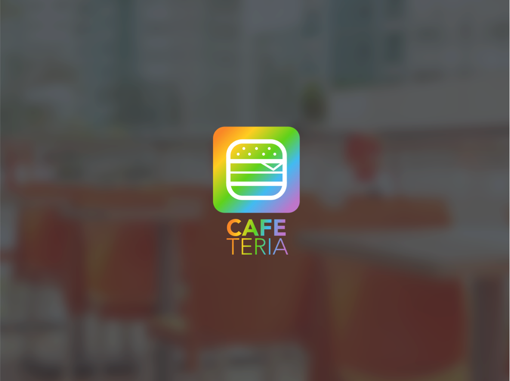
Screen 1: Landing Page
- Branding: The app’s name, “CAFE TERIA,” is paired with a colorful logo resembling a burger, which immediately conveys the app’s focus on food. The rainbow gradient in the logo suggests inclusivity and appeals to a younger demographic.
- Color Choices: The use of a white background with colorful buttons helps the elements stand out and makes the interface feel light and accessible.
- Button Design: Two distinct buttons labeled “Sign In as a Parent” and “Sign In as a Student” cater to the two different user types, ensuring a tailored experience right from the start.
- Typography: Clear, sans-serif typography is used for readability and a modern feel.
Screen 2: Student Login
- Color Consistency: The blue color of the logo and the login button provides consistency and reinforces the visual identity of the app.
- Input Fields: The email and password fields are designed with clear demarcation, ample spacing, and placeholder text to guide users smoothly through the login process.
- Call-to-Action: The “Login” button is highlighted in blue, drawing attention and suggesting the next step in the user journey.
Screen 3: Welcome/Lunch Menu
- Personalization: The welcome message “Welcome, Michael” adds a personal touch, improving user engagement.
- Menu Navigation: The navigation arrows next to the date suggest that users can browse through different days’ menus, giving them control over viewing options.
- Content Layout: The menu items are listed in a simple, easy-to-read format. This layout favors quick scanning and decision-making.
- Visual Hierarchy: The menu items are organized under clear subheadings for entrees, with accompanying descriptions that help users make informed choices.
- Interactive Elements: The bottom navigation bar includes icons for additional app features, encouraging exploration within the app.
The design choices across these screens show a commitment to creating a user-friendly experience that caters to both parents and students. The interface balances a playful, colorful aesthetic with the seriousness needed for an app that deals with financial transactions and educational content.

Screen 4: Menu Options
- Color Coding: Each menu category is assigned a unique color, creating a vibrant and visually distinct path for navigation. This not only makes the interface more engaging for students but also assists in quick category recognition.
- Layout: The menu categories are presented in large, easy-to-tap blocks, facilitating touch interaction and enhancing the user experience on mobile devices.
- Typography: The use of bold, capitalized text for category names ensures readability and draws attention to the different options available.
Screen 5: Notifications
- Information Hierarchy: Notifications are organized in a list format, with color-coded icons and borders that correspond to the nature of the notification (green for positive actions like adding money, red for denials).
- Actionable Items: Each notification comes with an ‘x’ symbol, suggesting users can dismiss or interact with them, which can help in maintaining an uncluttered notifications area.
- Visual Feedback: The use of color also provides immediate visual feedback on the status of requests and actions, making it easy for students to quickly understand what’s happening in their accounts.
Screen 6: Change Password
- Focus on Functionality: This screen is simple and free from any distractions, focusing the user on the task of changing their password.
- Input Fields: Clearly defined fields for ‘New Password’ and ‘Confirm Password’ guide users through the password change process. The use of boxes helps to delineate interactive elements.
- Navigation Cues: The back arrow at the top left suggests a simple way to return to the previous screen, maintaining a consistent navigation pattern across the app.
Across all screens, the design decisions are clearly aimed at creating a user-friendly experience. The interface prioritizes ease of use, with large touch targets and clear, colorful visual cues that would appeal to a younger audience, while also providing the straightforward functionality that would be expected by parents managing their child’s lunch account.

Student Menu

Screen 4: Dessert Menu
- Color Theme: The screen uses a blue color palette, which is calming and could be associated with the pleasure of enjoying a dessert.
- Iconography: Dessert options are represented with simple, engaging icons that are easy to understand at a glance, making selection straightforward.
- Cost Awareness: As with the previous menus, the total cost and daily budget are prominently displayed, encouraging students to make choices within their financial limits.
- Navigation Consistency: The presence of the ‘Add to Cart’ and ‘Next’ buttons, consistently located at the bottom, maintains uniformity across the app, helping students navigate without confusion.
Screen 5: Premium Menu
- Color Theme: A purple theme signifies a premium or special category, distinguishing it from the regular meal options and suggesting a more luxurious choice.
- Special Items: The premium menu offers branded items, indicated by familiar logos, suggesting partnerships with well-known establishments.
- Budget Management: The total cost is shown alongside the daily budget, highlighting the impact of premium choices on the student’s budget.
- Direct Access: A ‘Go to Cart’ button is included, likely because premium items might take a more significant portion of the budget, prompting students to review their overall choices more frequently.
These screens exhibit a cohesive design language that spans the entire app, with color-coded themes for different food categories and a clear display of budget information to foster financial responsibility. The iconography is chosen to be relatable and easy for students to identify, while the navigation is kept intuitive across different menu screens. The emphasis on cost and budget on each screen indicates the app’s educational goal of teaching students to manage their finances effectively.

Student Cart
Screen 1: Cart Overview (Over Budget)
- Informative Layout: The cart clearly lists all items selected by the user, along with icons indicating the ability to remove items.
- Budget Highlighting: The total cost versus the daily budget is displayed, with visual cues (such as color or bold text) to indicate when the user is over budget.
- Action Prompts: Users are given options to ‘Remove items till under budget’ or ‘Request Additional Item’, providing clear next steps for budget management.
Screen 2: Parental Interaction (Denial)
- Parental Notification: A mock notification appears on the student’s cart screen, showing a parent’s decision (in this case, denial) of an additional item request.
- Action Options: The student can remove the item or request additional funds, which is a crucial decision point facilitated by clear, accessible buttons.
Screen 3: Cart Confirmation (Within Budget)
- Positive Reinforcement: When the total is within the daily budget, the app provides a positive confirmation message, reinforcing good spending habits.
- Checkout Readiness: The screen shows a ‘Checkout’ button, indicating the user is ready to finalize their selections, maintaining a simple and direct call to action.
Screen 4: Checkout Completion with QR Code
- Final Confirmation: A congratulatory message confirms the successful checkout, which can provide a sense of accomplishment.
- QR Code Presentation: The QR code is prominently displayed for easy scanning at the point of sale, integrating digital transaction methods with physical collection points.
- Closure Option: A ‘Close’ button likely returns the user to the main menu, completing the transaction loop.
Throughout these screens, the design decisions support clear communication of budget status, straightforward navigation through the cart management process, and integration of parental control with student autonomy. The user is guided toward making informed decisions about their purchases, with visual aids to understand the financial implications of their choices. The QR code represents a bridge between the app and the real-world action of collecting the food items, streamlining the overall experience.

Parent Onboarding
Screen 1: Landing Page for Parental Login
- Branding: The app’s logo is displayed prominently, maintaining brand recognition and consistency.
- Colorful Call-to-Action: Two buttons with different colors differentiate between parent and student login, guiding users intuitively depending on their role.
- Simplicity: The screen is kept simple and free of clutter, which can help parents quickly identify their point of entry into the app.
Screen 2: Parent Login Page
- Color Theme: The use of green for the parent login page suggests security and trust, which is crucial for an app handling financial transactions.
- Form Fields: The email and password fields are straightforward, with a clear hierarchy and contrast against the white background, focusing on usability.
- Action Button: The ‘Login’ button is vibrant and placed prominently, encouraging parents to proceed with the action.
Screen 3: Parent Dashboard
- Financial Overview: The dashboard immediately presents a circular balance graphic, which is a visual and immediate representation of the account’s status.
- Analytical Insights: Below the balance, smaller graphics provide a quick view of spending habits over time (daily, weekly, and monthly averages), offering parents an instant understanding of their child’s spending trends.
- Navigation Indicators: The presence of a home icon and a settings gear icon suggests additional navigational options, likely leading to more detailed account management tools.
Across all these screens, the design prioritizes clarity, ease of use, and trust, which are key for an app designed for financial management and parental oversight. The color choices, iconography, and information architecture are all aimed at creating an intuitive user experience that simplifies the process of managing a student’s school-related expenses.

Screen 4: Budget Setting
- Color-Coded Options: The budget setting screen uses a rainbow of colors to differentiate between budget periods like ‘Per Day’, ‘Per Week’, and ‘Per Month’, which can help users quickly identify and select the appropriate option.
- Clear Hierarchy: The options are presented in large, easy-to-tap blocks, making for a user-friendly selection process. This is effective for providing a clear path for users to customize their budget settings.
- Customization: There are ‘Custom’ and ‘Smart’ options, implying advanced budgeting features that can be tailored to individual needs, providing flexibility and control over the budgeting process.
Screen 5: Notifications
- Information Hierarchy: Notifications are organized in a list with icons indicating the type of notification and color-coding for at-a-glance understanding (green for confirmations, yellow for pending actions, and red for denials).
- Interactive Design: The presence of ‘x’ marks suggests users can dismiss notifications, helping to manage and declutter the notification feed.
- Real-Time Updates: The design implies that these notifications are real-time updates, keeping parents or students informed about account activity, which is essential for managing finances actively.
Screen 6: Approval Request
- Focus on Interaction: This screen displays a request for approval of an additional item (a premium pizza), highlighting the cost and providing ‘Approve’ or ‘Deny’ options, which are clear and actionable for quick decision-making.
- Contextual Information: The name and balance are shown, providing context to the decision-maker about who is making the request and what the current balance is, which is critical for informed approval or denial.
- Visual Emphasis: The use of a prominent green card for the request draws attention to this pending action, ensuring it doesn’t get overlooked.
Across all screens, the design is focused on clarity, ease of navigation, and intuitive interaction, with a strong visual language that communicates information effectively through color and iconography. These screens seem well-considered to ensure that managing and tracking budgets is a straightforward and hassle-free process for users.

Parent Budgeting
Screen 1: Daily Budget
- Color Theme: The vibrant orange color theme suggests energy and enthusiasm, suitable for budgeting decisions that impact a student’s day.
- Budget Options: Different budget options are clearly displayed as clickable buttons, making the decision process straightforward.
- Cost Visualization: The total and average daily budget are highlighted, aiding users in understanding their spending habits and financial planning.
Screen 2: Weekly Budget
- Color Theme: A bright yellow theme implies optimism and attention to detail, associated with careful weekly budget planning.
- Budget Options: Similar to the daily budget screen, different options are presented in an easy-to-select format.
- Cost Visualization: The total and weekly average are again emphasized, ensuring users can track their budget over a longer period.
Screen 3: Monthly Budget
- Color Theme: The green color theme conveys stability and reassurance, important for students managing their monthly expenses.
- Budget Options: The monthly budget screen follows the same pattern as the previous ones, offering consistency.
- Cost Visualization: Emphasizing the total and monthly average budget, the screen helps users visualize their spending in a broader context.
These screens are designed to facilitate users’ budget management by providing visual aids, clear options, and consistent color themes to differentiate between the various time frames of budgeting. The presentation and usability aim to make the financial tracking as intuitive and engaging as possible.

Screen 4: Custom Budget Setting
- Calm Blue Theme: The use of blue for the custom budget setting screen suggests personalization and flexibility, aligning with the idea of a tailored budgeting experience.
- Customization Options: Users can select a custom amount to spend per week, with an easy-to-use dropdown menu, reinforcing the personalized budgeting approach.
- Financial Overview: The display of the total weekly budget and its daily equivalent reinforces the app’s educational aspect, by making financial implications clear.
- Control Buttons: “Set Custom Schedule” and “Stop Custom Schedule” buttons provide clear actions for users to manage their custom budget, emphasizing user control and simplicity.
Screen 5: Smart Budgeting
- Luxurious Purple Theme: The rich purple color implies a sophisticated, technology-driven feature, suitable for an AI-powered budgeting option.
- AI Integration: The option to “Enable AI” or “Disable AI” for budgeting decisions suggests an advanced feature that offers automation and intelligence in financial planning.
- Simplicity: The screen layout is straightforward, with two prominent buttons providing a simple choice between enabling or disabling the smart feature.
These screens are designed with the user’s ease and financial understanding in mind, incorporating color psychology, clear visual cues, and straightforward interactions that allow for a user-friendly budget management experience. The design choices reflect a balance between personalization and automation in financial planning within the app.

Parent Settings
Screen 1: Settings Screen
- Organized Layout: The list of settings options is clearly presented, making it easy for users to find what they need.
- Visual Consistency: The use of green highlights signifies important features, creating a coherent color theme throughout the app.
- User Control: The settings are laid out in a simple manner, empowering users with control over their app experience.
- Accessibility: The design is straightforward, which aids in navigation and usability, particularly for users who may not be tech-savvy.
Screen 2: Change Password Screen
- Focused Functionality: This screen is dedicated solely to password management, minimizing distractions and making the process more efficient.
- Input Clarity: Text fields are clearly labeled, facilitating ease of input for new and confirmation password fields.
- Simplicity: The design is uncomplicated, with a single action button to submit the password change.
Screen 3: Payment History Screen
- Financial Transparency: The payment history is neatly displayed in a list, making it simple for users to review their transactions.
- Consistent Theme: The green accents are used again, maintaining the visual harmony and signifying the financial nature of the app.
- Ease of Review: The layout allows users to quickly scan through their payment history, emphasizing the app’s user-friendly approach.
Each screen is designed to offer a seamless user experience, with each element carefully considered to serve its purpose without overwhelming the user. The consistent color scheme aids in navigation and creates a pleasant visual experience, while the clear layout of features emphasizes ease of use and accessibility.

Screen 4: Payment Method Screen
- Clarity of Information: Payment methods are displayed in a list format, with sensitive information partially obscured for privacy.
- Action Accessibility: “Add New” and “Delete” buttons are prominently positioned for straightforward management of payment options.
- Visual Consistency: The green color theme, associated with financial transactions, is used for key elements to maintain consistency and ease of identification.
Screen 5: Manage Students Screen
- Simplified Management: The screen provides a simple list of students associated with the account, with an option to remove students as needed.
- Functional Layout: The “Name” and “Student ID” input fields, along with the “Add” button, offer a clear path to include new students, making the process intuitive.
- Data Privacy: Personal details are displayed with care, keeping sensitive information confidential while allowing easy management.
Screen 6: Contact Us Screen
- Support Accessibility: Clear instructions and options for support are provided, ensuring users understand where to go for assistance.
- Focused Communication: Direct options for contacting support via chat or phone highlight the app’s commitment to user support.
- User Guidance: Additional links to FAQs and helpful information suggest a user-friendly approach to help users find answers quickly.
Each design decision made for these screens is focused on creating an efficient and pleasant user experience. The screens are designed to be intuitive, minimizing user effort and maximizing clarity. The consistent use of color enhances the visual appeal and aids in the intuitive use of the app’s features.

Project Takeaways
- User-Centric Design: A key takeaway from this project is the importance of a user-centric design approach. The interface was crafted with the needs of two distinct user groups in mind: parents and students. By considering their unique perspectives and requirements, the app provides a tailored experience that simplifies budget management for parents while making the food selection process engaging for students.
- Educational Integration: The project successfully integrates educational elements into the user experience, teaching students about budgeting through real-time feedback on their food choices. This feature not only supports the app’s functionality but also adds value by instilling financial literacy at an early age.
- Color Psychology and Navigation: The thoughtful use of color psychology across various menu screens enhances navigation and category recognition. The consistency in layout across these screens reinforces user familiarity, reducing cognitive load and streamlining the selection process.
- Accessible and Inclusive Design: Accessibility features were carefully woven into the app’s design, ensuring that it is inclusive and can be easily used by individuals with diverse abilities. This commitment to inclusivity not only broadens the app’s user base but also reflects a modern approach to app development.
- Real-time Decision Making: By providing users with immediate budgetary feedback, the app empowers students to make informed decisions on the spot. This real-time decision-making capability is a standout feature that encourages responsible spending habits.
- Visual Clarity and Feedback: Visual clarity in the presentation of options and immediate feedback on user actions contribute to an intuitive user experience. The design ensures that information hierarchy is maintained, and essential details are not lost in the visual appeal.
In wrapping up this case study, the CafeTeria app stands out as a beacon of innovative design that marries functionality with education. It represents a leap forward in how technology can be harnessed to enrich the daily routines of its users – in this case, the routine of choosing and purchasing school meals. By integrating budget management into the food selection process, the app does more than just streamline transactions; it teaches life skills in a context where they are immediately applicable. The app’s vibrant interface, intuitive navigation, and accessible design come together to create an experience that is as delightful as it is instructive. As the students of today grow into the financially savvy adults of tomorrow, they may well look back at the CafeTeria app as one of their earliest and most practical lessons in financial literacy. This project encapsulates a vision where technology doesn’t just make life easier; it also makes it better.