The Brief
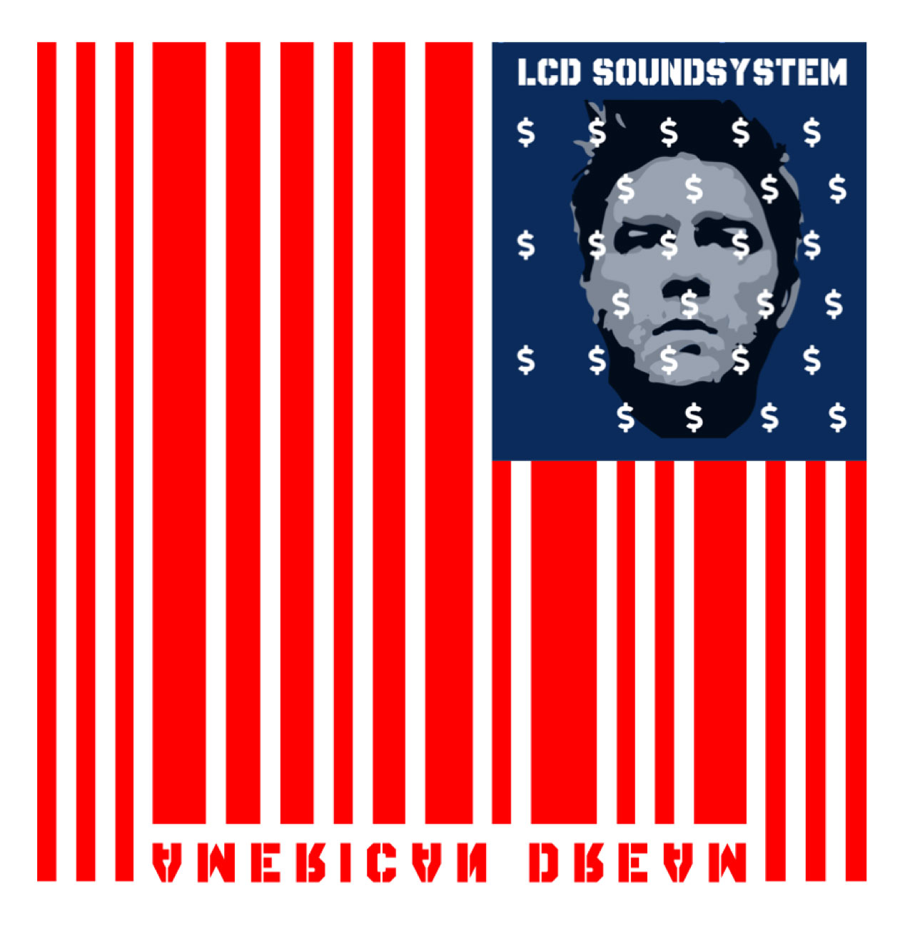
The creative brief for the album cover redesign of LCD Soundsystem’s “American Dream” called for the transformation of a mundane item into something extraordinary, intertwining it with the album’s themes. In an innovative approach, I merged the emblematic American flag with a barcode, a symbol of commerce and consumerism.
This fusion redefines the album’s visual identity, serving as a powerful critique of the contemporary American dream. The concept suggests that the American dream has undergone a commercial metamorphosis, becoming commodified and accessible to those who can afford it. The redesigned album cover stands as a poignant reflection of this shift, encapsulating the essence of the dream’s new incarnation as a marketable entity, available for purchase in the societal marketplace.
Results
In my redesign, I preserved the iconic red, white, and blue palette of the American flag, deliberately inverting the album title to signify that the American dream has been altered or is perhaps now a reversed reflection of its original ideals.
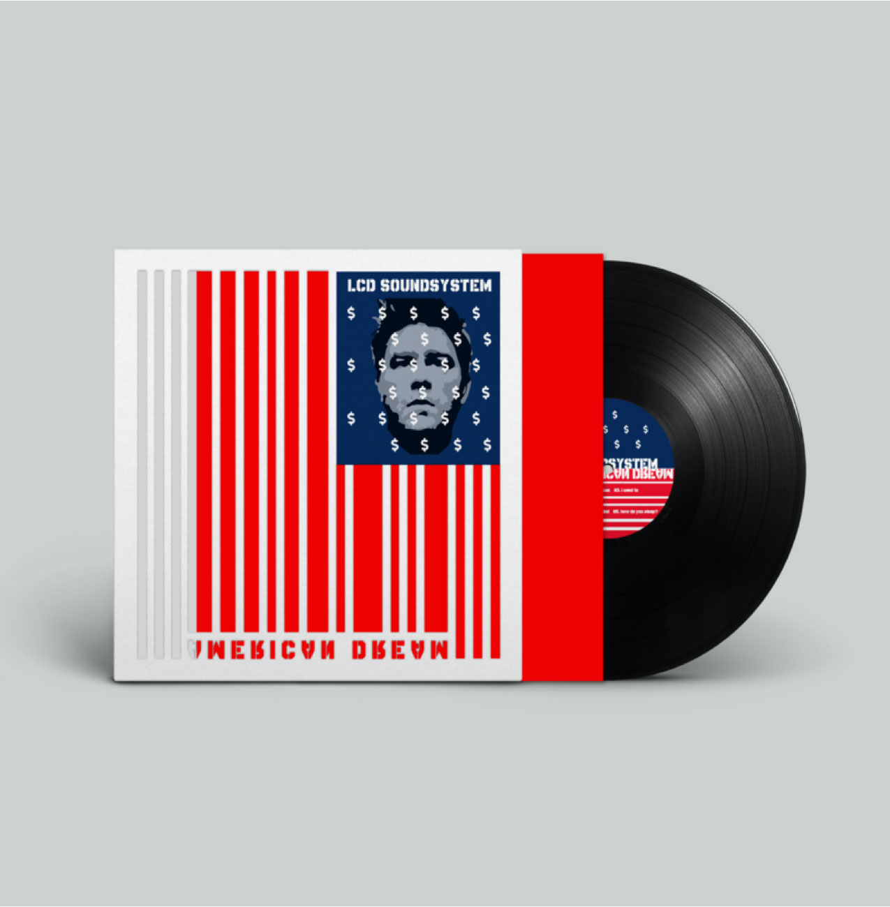
To deepen the visual impact, I incorporated an interactive red album insert. This element is designed to be integral to the artwork: the cover features precise laser-cut portions, which, when combined with the insert, finalize the flag’s imagery. This physical interaction required to ‘complete’ the flag mirrors the effort needed to grasp the elusive American dream, suggesting that what once was given now requires active participation to obtain. The result is not only a statement piece but an engaging experience that requires the listener to piece together the symbol of the dream, thereby completing the narrative of the album.
Album Cover
The album cover for LCD Soundsystem’s “American Dream” is a visually arresting piece that thoughtfully integrates the American flag’s color scheme with a barcode motif to symbolize the commodification of American ideals. The red and white barcode stripes stand in for the flag’s stripes, while the blue field is darkened, perhaps to suggest a critique or reflection on the state of the American dream.
The design employs a mirrored typography for the album title, inviting viewers to contemplate a reversed or altered interpretation of the dream. This decision to invert the text acts as a subtle nudge for introspection on the values and reality of the American ethos.
Central to the design’s concept is the use of die-cut elements, which reveal the red album insert beneath. This inventive feature allows the red portions of the flag to be physically completed by the listener, a metaphor for the active participation required in shaping one’s destiny and the American dream itself. The act of inserting the red piece not only completes the visual composition but also engages the holder in the narrative of the album, making the experience of the design as interactive and thought-provoking as the music it encases.
The cover also presents a portrait infused with the motif of dollar signs where the stars would traditionally be, further emphasizing the theme of commercialism entwined with national identity. The use of a simple, modern sans-serif font for the band’s name aligns with the contemporary essence of their music and the current interpretation of the American dream.
In summary, the album cover is a bold statement on the American dream’s transformation, utilizing interactive design elements to convey its message and engage its audience in a dialogue about value, identity, and aspiration in the modern era.
Back Cover
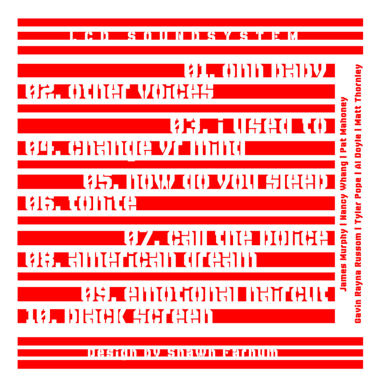
This back cover of the album incorporates the same patriotic red and white color scheme as the front, aligning with the overall aesthetic of the American flag. However, in this context, the stripes are filled with text – the song titles and band members’ names – which plays into the barcode concept introduced on the front cover.
The typography is fragmented and interspersed within the stripes, mirroring the pattern of a barcode and reinforcing the notion of commercialization. This design choice cleverly represents how the contents of the album – its music and creators – are part of the ‘product’ being offered. The disruption of the text challenges the viewer to engage more deeply with the design to extract the information, symbolizing the effort needed to discern the true meaning of the American dream today.
The layout of the text in barcode-like stripes maintains a clean and structured form while also suggesting a sense of disorder, reflecting the album’s themes of disillusionment and the complexity of contemporary life. The choice to overlay the text so that it becomes part of the flag’s stripes suggests that these songs and individuals are woven into the fabric of America, contributing to the nation’s cultural narrative.
Overall, the back cover is a continuation of the front cover’s commentary, using graphic design to provoke thought about the commercial aspects of art and culture in a nation where everything has a price.
Die Cut Mock-Up
The album mock-up showcases a die-cut design that cleverly utilizes the physicality of the vinyl format to engage the listener in completing the album’s visual narrative. The record sleeve features strategic cutouts that invite the listener to interact with the album by inserting the vinyl record, which contains elements of the artwork, to complete the overall design. This die-cut approach not only adds a layer of depth and texture to the album cover but also serves as an inventive method to convey the message that the music itself is an essential piece of the American dream. It turns the record into an active participant in the art, emphasizing that the value of the content goes beyond the surface, much like the pursuit of the dream it represents. The result is a multidimensional and immersive experience that blurs the lines between static artwork and dynamic interpretation.
