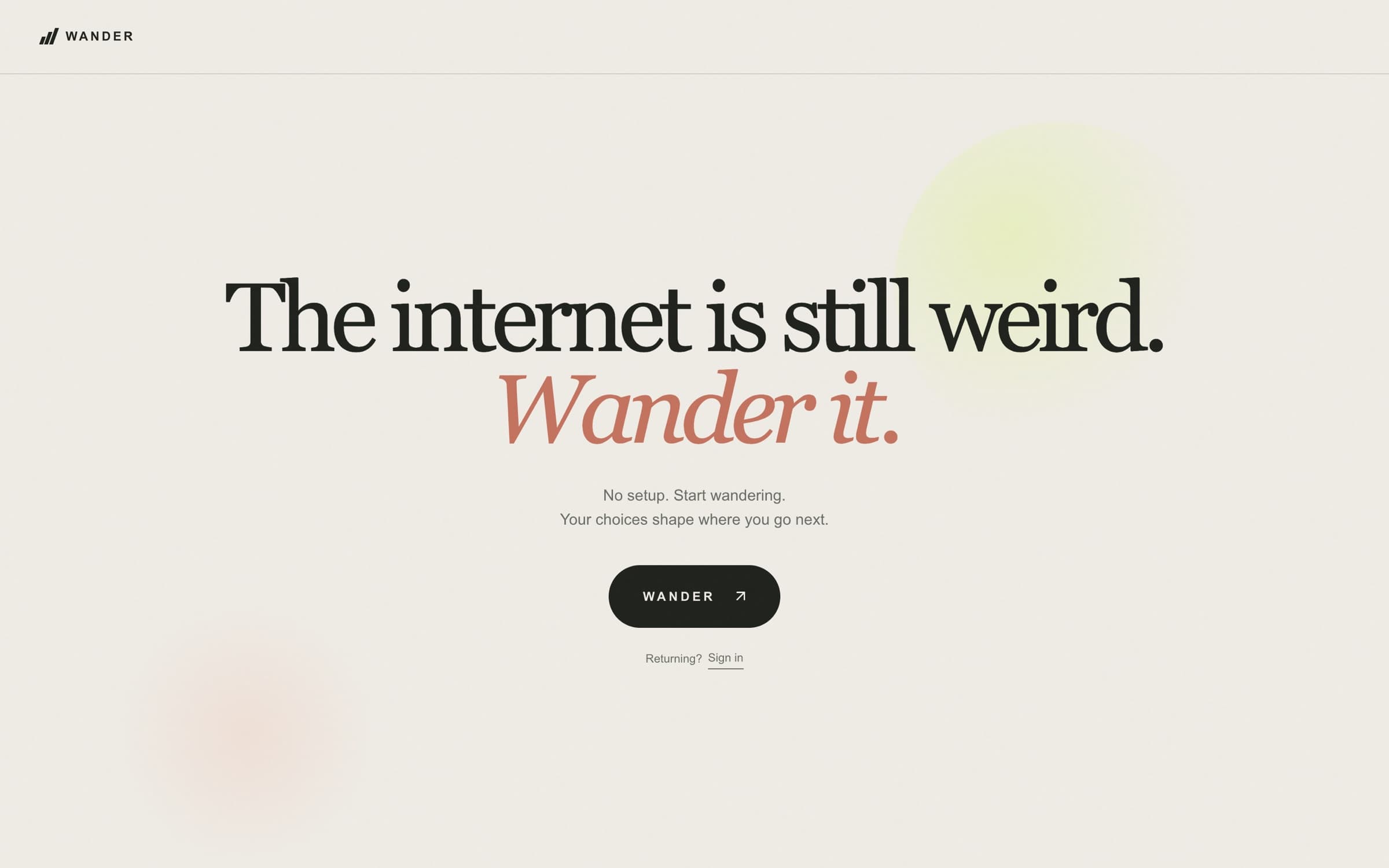
Live product, wandr.it first arrival
Back to workWander
LiveWander: Making the internet feel worth exploring again
Independent product design, UX research and design engineering
I created Wander to help people discover interesting websites without starting with a search query. Press one button and it opens the door to a hand-reviewed website; keep going and a trail forms behind you. I led the product direction, experience design and research, built it with AI-assisted engineering, then used real participant studies and technical evaluation to test where the idea holds up.
Quick scan
- The problem: search is useful when you know what you want. I wanted to design for curiosity before the query exists.
- My role: I owned the product vision, scope, interaction and visual decisions, research questions and release decisions, and built the working product with AI-assisted engineering.
- The experience: one action leads to an editorially reviewed website. Trail, direction controls, reactions and an optional account appear gradually, and wandering never requires signing up.
- The system: a curated index and topic-based scoring connect the current path to unseen destinations, and history that follows the visitor keeps a new trail from quietly repeating old places.
- The evidence: in a five-person alpha pilot, all five reported finding something they probably wouldn't have found alone. A later first-visit study was shorter and more uneven, and left comprehension unresolved.
- Where it stands: Wander is publicly available. Both studies are closed, v1.0 isn't launched, and the recommendation approach has known limits I've documented rather than tuned away.
Team
Independent, with research participants, reviewer input and AI assistance
Role
Product designer, UX researcher and design engineer
Timeline
September 2026 to present
Status
Publicly available at wandr.it · v1.0 in progress
The opportunity: discovery before the query
Search works when I can already name what I want. I missed the other kind of internet experience: stumbling into an unfamiliar archive, an odd interactive site or someone's small obsession, then following a trail I couldn't have planned.
StumbleUpon was an early influence. My question was whether discovery could feel less like a feed and more like opening one door at a time, with the person free to spend their attention on the destination. Time inside Wander isn't the goal.
So the first version is a simple loop: arrive, press Wander, open the website if it interests you, come back when you're ready, and continue. The product couldn't ask someone to define their tastes before they had experienced it.
What I owned and built
Product and experience
The product direction and its central principle, that wandering should teach the experience. The first-visit hierarchy, when each control appears, the anonymous-to-account path and the visual direction.
Research
The research questions, two participant studies and the offline evaluations used to challenge my own decisions, and the call on what each result could and couldn't support.
Engineering, with AI assistance
The working web product. AI helped write code, tests and analysis; I decided what it should do, reviewed the output and controlled what shipped. It began from an imported frontend prototype, so I don't claim every line.
Designing for curiosity
My starting hypothesis was that wandering could be the onboarding. I wanted someone to experience a Discovery before learning any controls or being asked for an account. I think of a street magician who shows you the trick before selling you a ticket: the product should give a reason to care before it asks for any commitment.
The first screen keeps the choice small, a short premise and one button. After that, the interface adds a concept only when it becomes useful.
What appears, and when
Arrival
A one-line premise and the Wander button. No setup, no account, no preferences to fill in.
After the 1st Discovery: Trail
Once there's a path behind you, the trail appears to show it.
After the 2nd: Familiar, Explore, Wild
How far the next step should reach. Explore is the default, and changing it affects the next request without navigating anywhere.
After the 3rd: Reactions
Interesting, More like this and Not for me, once there's enough of a trail for feedback to mean something.
After the 4th: Wander From Here
Start a trail from any public URL, for someone who has the idea of the product by now.
Later: an optional account
Offered only after real history, such as eight Discoveries with three reactions or saves. It preserves a trail; it never unlocks the core experience.
The timing comes from the teaching sequence in the v0.7.8 release. It shows when each feature enters, not what participants learned from it.
Letting the destination carry the attention
The visual design supports that order. Editorial typography, generous space and warm light and dark themes keep the interface quiet so the website you land on is the thing you notice. Those are my design intentions, not measured emotional outcomes.
There's a real tradeoff. Someone can leave before ever meeting the later features. I accepted that, because a first visit doesn't need to become a tour of the interface. The question is whether the central experience makes sense and offers something worth a person's time.
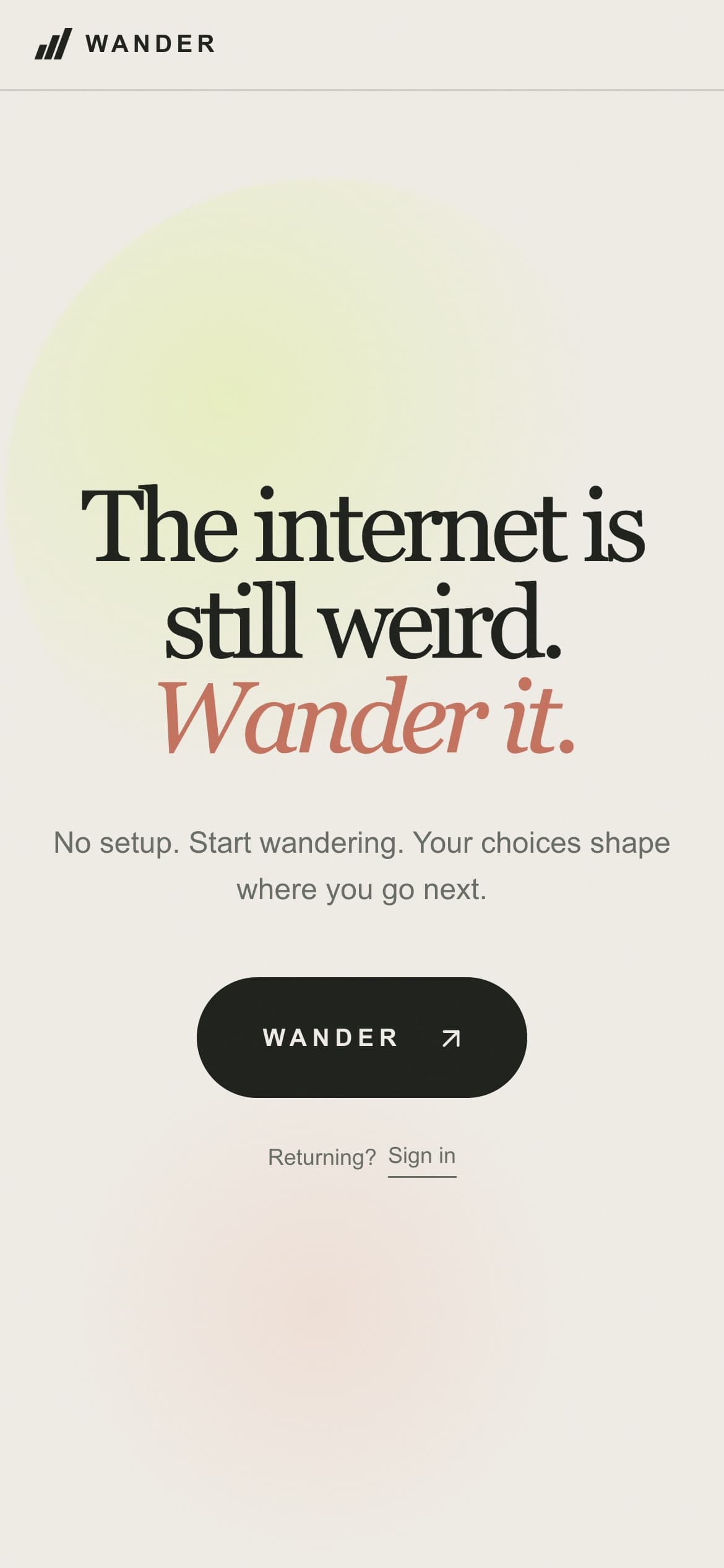
Live product at a 390-pixel mobile width
The discovery system
I think of Wander as a landscape of possible journeys rather than a list of websites. A destination matters on its own, but so does where it might lead next. That pushed me to look at relationships, variety, repetition and dead ends instead of treating a bigger collection as automatic progress.
It also needs a precise description of what the product runs today. Each Discovery is a curated record: a canonical URL, title, description, content type, topic labels, quality and obscurity scores, domain and publication status. The runtime doesn't store a semantic graph, search for paths or use embeddings. Shared topics are a rough relationship signal, and the graph I analyze is built offline from those labels, as a diagnostic.
How the next Discovery is chosen
Selection runs on the server for every request, with the visitor's history and trail kept in Postgres, so the same rules apply on every device and every visit.
What shapes each request
Existing history
Everything this visitor has been shown, across every trail and return visit.
Feeds step 2
Trail context
The previous Discovery's topics, or the starting URL for Wander From Here, plus topics already visited on this trail.
Feeds step 3
Reactions
Interesting, More like this and Not for me add topic affinities that fade as the trail moves on.
Feeds step 3
Familiar, Explore or Wild
Changes how much each scoring factor counts. It never filters anything out.
Feeds step 3
Every Wander request
Step 01
Curated Discovery index
A versioned, editorially reviewed set of records, loaded by the app rather than generated live.
Step 02
Eligibility and seen filtering
Only published records this visitor has never been shown. If none remain, Wander says so instead of recycling.
Step 03
Topic and context scoring
Quality, relevance, novelty, variety, obscurity and a small exploration factor, with a soft penalty for domains seen in the last three steps.
Step 04
Candidate selection
Rank every candidate by score, then pick at random from the top three.
Step 05
Next Discovery
Shown to the visitor, added to the trail and remembered as seen.
The returned Discovery joins the trail and the visitor's history, which shape the next request.
What Familiar, Explore and Wild actually change
The three modes are weightings of the same score, which is why they can be meaningful without asking anyone to build a profile. Familiar leans on relevance to where you just were. Wild gives that up for novelty, variety and obscurity, while keeping quality high.
Familiar
- Relevance35%
- Quality30%
- Novelty15%
- Variety10%
- Obscurity7%
- Exploration3%
Explore (default)
- Relevance20%
- Quality30%
- Novelty20%
- Variety15%
- Obscurity10%
- Exploration5%
Wild
- Relevance8%
- Quality25%
- Novelty25%
- Variety20%
- Obscurity14%
- Exploration8%
Scoring weights from the v0.7.8 release source. The labels express intended distance; they aren't three separately validated experiences.
Never quietly repeating a place
"Never show me that as new again" couldn't be a screen-level preference. It had to survive trails, reloads and optional account creation, so it lives in the API and the database. A skipped destination is still remembered as seen, but isn't treated as a dislike. Starting a new trail changes the path, not the memory, and when no unseen destination remains, the product says so.
Wander From Here accepts any public URL as a starting point. If it matches an indexed Discovery, its topics are used. Otherwise the server derives a few topic hints from the URL's host and path, with a small hand-written map of related words. It doesn't fetch the page. It's a starting-point heuristic, not an understanding of arbitrary web content.
What evaluation revealed
The topic graph turned out too weak to carry the story I wanted to tell about meaningful connections. An offline audit of 118 published Discoveries compared every pair of them:
6,903 pairs of Discoveries
- Share a specific topic239 · 3.5%
- Linked only by broad family topics, like art or history2,914 · 42.2%
- Share no topic at all3,750 · 54.3%
A historical offline snapshot, not today's live corpus. On specific topics alone the graph split into 39 pieces, with 31 Discoveries left isolated, 30 of them reachable only through broad labels. These counts describe metadata, not whether a person would find a transition interesting.
Alternatives I tested. None of them shipped.
Small human reviews also warned against equating shared tags with a good connection: specific-topic transitions were rated more related in a limited set of cases, and other findings were mixed. So rather than assume new weights would fix the experience, I tested alternatives against quality gates set in advance:
- A context-aware Explore shortlist widened the candidate pool, but fell below its quality comparison and favored sparsely tagged destinations.
- A one-over-rank draw, which weights candidates by the inverse of their rank, failed quality gates in every mode.
- A later challenger failed its preregistered technical gate: overall quality missed the required bound and ten of twelve test conditions failed, so its remaining phases were never run.
The lesson
Not that the current engine is validated. Interesting destinations don't automatically make an interesting journey, and a tidy graph isn't evidence of discovery. I closed each experiment rather than tuning until a preferred result appeared. Whether Wander's paths feel coherent, surprising and worth following is still a human question, and the next section is where I asked it.
Testing assumptions
I ran two studies to see what happens when people meet Wander, and kept their findings separate.
Alpha01 was a first signal. It was a small consented pilot with an optional debrief, built around a hypothesis I wrote down beforehand: someone clicks Wander ten times and wants an eleventh. Firstvisit01 tested the premise without me. It was remote and unmoderated, with consent before exploring and an optional questionnaire after the fifth Discovery. It ran in Production and closed on October 27, 2026.
What the studies recorded
Alpha01 · initial wave
Five participants
- Found something they probably wouldn't have found alone5 of 5
- Asked for an 11th Discovery after the 10th5 of 5
Firstvisit01 · first visit
11 consented participant records
- Started exploring10
- Reached five Discoveries5
- Submitted the questionnaire3
Small, self-selected formative studies. Counts summarize study records and shouldn't be read as population estimates.
What the studies couldn't tell me
- Alpha01's answers were encouraging, but five people aren't a population and finishing ten Discoveries isn't retention. Trail and the distance controls were described differently by different people, no one used Save or Wander From Here, and one participant needed help finding the study's Finish control.
- Firstvisit01's 11 records aren't 11 verified unique people. Activity was very uneven: the median trail was three Discoveries, and one record accounted for 60 of 103 presentations. One of the three questionnaires arrived before any recorded Discovery.
- Seven participants' last recorded action involved the study controls. That's an association, not a reason they stopped. An opened destination shows someone went through the door, not that they read or enjoyed what was there.
What I did with that
The research complicated my assumptions without settling the design. Several people started without any guidance, but short sessions and thin questionnaire coverage left basic comprehension and perceived value unresolved. I didn't respond by adding instructions to the interface. I want to understand what participants meant before I change the experience.
Design decisions and tradeoffs
The clearest decisions came where I could separate a visible defect from an open product question. I fixed demonstrable reachability problems, and left preference and comprehension questions to research, rather than letting the speed of AI-assisted building turn every uncertainty into another feature.
Three decisions from the mobile screen
Constraint
A local layout investigation found Keep wandering, the main action, pushed below the first screen on short phones by the destination preview and description.
Decision
I compared tighter spacing, a shorter preview and moving the action earlier, then kept the preview and moved the action closer to the destination link.
Resolution
Evidence was a measured comparison of matched local layouts, not a participant study or a satisfaction claim.
Constraint
Putting the How Far? modes above Keep wandering made their link to the next Discovery explicit.
Decision
I rejected it. The extra height pushed the main action lower in three of four matched short journeys and added three keyboard stops. A disclosure menu would have hidden the choices behind another tap.
Resolution
A compact variant that places the modes after Keep wandering is frozen as a research comparison. It's a candidate, not a winner; no participant result exists yet.
Constraint
AI-assisted engineering made it cheap to answer every unclear finding with a new feature.
Decision
Fix what's measurably broken, such as an unreachable action. Hold what's a matter of preference or understanding for research.
Resolution
Trail, How Far?, Save and Wander From Here weren't redesigned from a five-person pilot.
Building something trustworthy
The discovery promise depends on the system remembering what it has shown and on the doors leading somewhere safe. Those boundaries took real implementation work, because convenience could otherwise turn into unwanted identity linking, hidden tracking or lost history.
Where trust is enforced
Memory that holds
The API and database enforce no-repeat across trails and return visits. The corpus is a versioned, reviewed index, not a list a model generates on the fly.
Identity is optional
Anyone can start anonymously. An account only preserves history across devices, and export and deletion live under Your data. Research consent is separate and never feeds ranking.
Destinations are checked
Ingestion treats every URL as untrusted and verifies candidates before editorial approval. Static preview images mean Wander never loads a third-party page inside itself.
An accessibility failure a screenshot wouldn't show
A local review found the sign-in and Wander From Here dialogs clipping their controls on short screens, and a recoverable account error that could leave keyboard focus in the wrong place. I fixed the dialog scrolling and made focus return to the right place. Four of nine reproduction probes had failed; all nine passed afterward, along with focused automated browser checks.
That fix is local and not deployed yet, and it isn't an accessibility certification. Physical devices, assistive technology and the hosted product still need checking.
Outcomes and lessons
Wander is publicly available, and v1.0 is still in progress. The strongest evidence so far is that a small first pilot reported worthwhile discoveries, while the later first-visit study showed the experience still needs more evidence about comprehension and value.
What's true today
Live
- Wander is publicly available at wandr.it. The last documented release is v0.7.8, from October 27, 2026.
- Anonymous wandering, Trail, the three modes, reactions, saves, Wander From Here and optional accounts.
- No-repeat history enforced on the server.
Local, not deployed
- The dialog scrolling and focus fix.
- Further corpus and reliability work since the release.
- A compact How Far? variant, frozen for comparison.
Not established
- Sustained return, broad appeal or revenue.
- A recommendation approach better than the current one.
- A winning How Far? design.
The bar I'm holding v1.0 to
Not a perfect algorithm or a feature-complete roadmap. A trustworthy destination, an understandable first action, dependable memory, essential accessibility, and evidence that people find something worth their time.
I started with a belief that the internet could still surprise us. Building Wander has made me more careful about what counts as evidence for that belief. The product is real and available. Whether it consistently earns someone's curiosity is what I'm still working to learn.
Where discovery could go next
The longer-term idea is whether relationships between discoveries could reach beyond websites, to creative work, music, events, places or experiences offline. That's an exploration, not a roadmap or a validated need, and none of it is built.
Before extending the model I'd need to learn what counts as a meaningful connection across different kinds of things, how people can steer without turning wandering into search, how to represent place and time responsibly, and how to protect privacy when discovery leaves the web. The current topic graph is already too thin for websites alone, so the first product has to earn those questions. For now, the web is Wander's only tested surface.
Behind the Build
For a deeper look at the research, decisions and technical work behind Wander, I've included two companion documents.
PDF · 12 pages · 15 min read
Wander: Product Design & Development
The product framing, interaction decisions, the full selection architecture and scoring, the graph evaluation, rejected experiments and the tradeoffs behind them.
Download PDF: Wander: Product Design & DevelopmentPDF · 10 pages · 10 min read
Wander: Research & Evidence Companion
Research methods, aggregate findings and limits, design-decision records, how the technical evaluations were run, and what remains unverified.
Download PDF: Wander: Research & Evidence Companion