The Breif
The magazine redesign project represented both a significant challenge and a milestone in my design career. In the initial stages, I focused on a theme of life amidst fire, which was exemplified by images like a firefighter in the opening spread and a sunflower in the following one. Despite dedicating nearly three-quarters of the project’s timeline to this concept, I was left with a sense of dissatisfaction regarding the layout. It didn’t quite reach the standard I aspired to, marking a low point in my design journey, yet it also catalyzed a pivotal moment of growth and discovery in my approach to magazine layout design.
Results
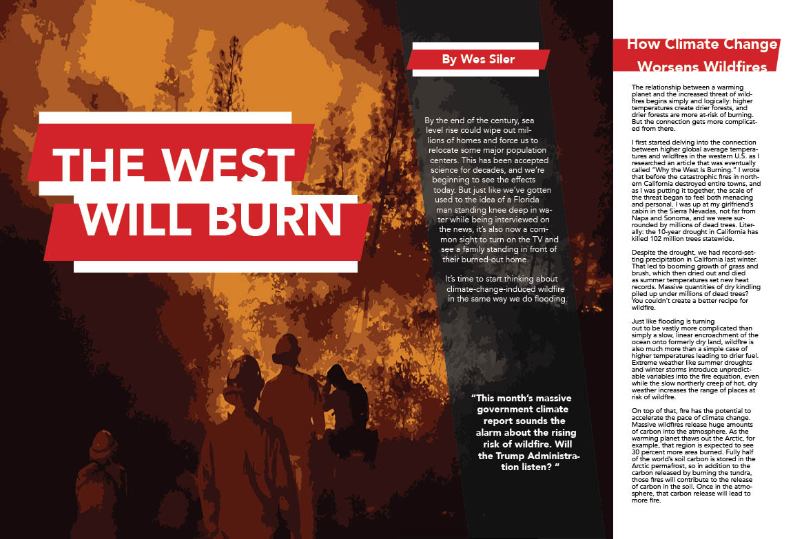
I embarked on a fresh approach with the layout, opting for a striking red and white title for the story. This color scheme extended to the headlines and select quotes, creating a cohesive visual identity throughout the layout. Experimenting with the figure-ground concept on the titles added an intriguing layer of visual interest, prompting the printer to inquire about its intentional design. This technique effectively guides the viewer’s gaze across the layout, enhancing its overall appeal.
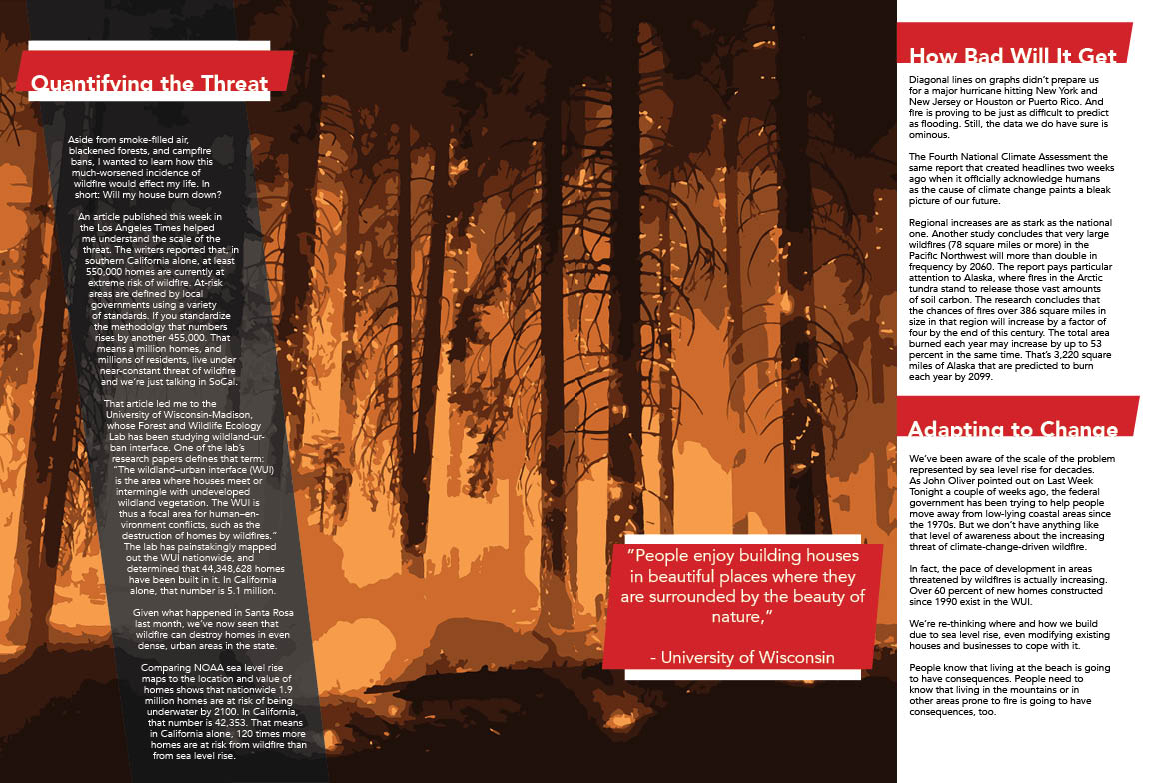
In the initial iteration of the second layout, I incorporated black-and-white imagery reminiscent of old documentaries, aiming to evoke the essence of fire. However, the imagery lacked the desired impact. Subsequently, I refined the background imagery to immerse the viewer in the intensity of the fire alongside the firefighters. By carefully selecting and utilizing images, coupled with the image trace feature in Illustrator, I achieved a raw and evocative portrayal of flames engulfing figures and trees. This deliberate blurring of details underscores the emotional weight of the article, resonating with the themes explored within.
Page 1 & 2 Fold
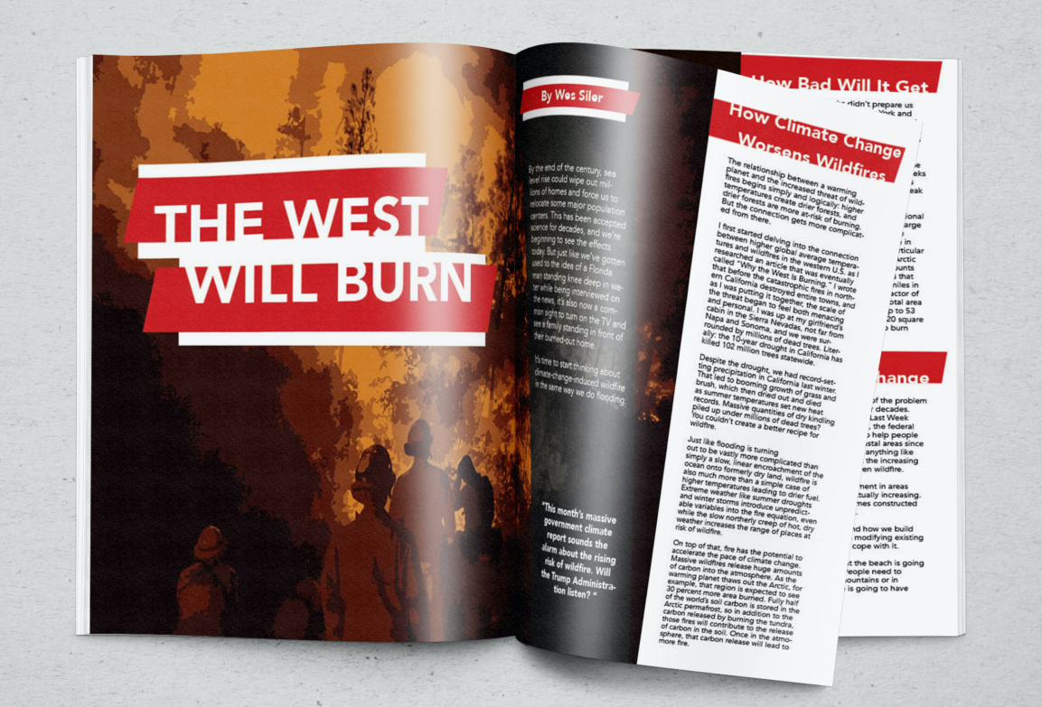
The image is a two-page magazine spread with a bold and impactful design that utilizes imagery, color, typography, and layout to convey a documentary-style seriousness and urgency about climate change and wildfires.
Imagery: The left side features a striking illustration of firefighters in silhouette against a backdrop of flames and smoke. The use of silhouettes adds a dramatic effect and emphasizes the human element in battling wildfires. The image conveys action and a sense of immediacy, as the firefighters appear to be moving through a dense and dangerous environment.
Color: A fiery palette of deep reds, oranges, and dark browns dominates the spread, simulating the look and feel of fire and smoke. This color scheme is not only visually arresting but also symbolically powerful, representing the danger, urgency, and destruction caused by wildfires.
Typography: The headline “THE WEST WILL BURN” is in a large, bold, sans-serif typeface, staggered on red banners that cut across the page, resembling caution tape and reinforcing the alarm raised by the text. The typography is intentionally jarring, and designed to grab attention. The body text is smaller, clean, and legible, ensuring that the information is accessible while the headline conveys the gravity of the situation.
Concept: The layout is reminiscent of a documentary film poster, aiming to present the subject matter as both a current event and an ongoing issue needing immediate attention. The right side of the spread uses columns and a clear hierarchy of information to guide the reader through the text, which provides context and depth to the issue presented by the imagery on the left. The quote “This month’s massive government climate report sounds the alarm about the rising risk of wildfire. Will the Trump Administration listen?” functions as a provocative pull quote, designed to engage the reader and pose a critical question about the response to the climate crisis.
Overall, the design effectively combines visual elements with text to create a sense of narrative and urgency, compelling the reader to engage with the content as they would with a hard-hitting documentary.
Page 3 & 4 Fold
Imagery: This page of the magazine spread features a haunting illustration of a forest ravaged by wildfire. The image shows trees stripped of foliage, with branches and trunks standing stark against the fiery backdrop. This forest scene is devoid of wildlife or human presence, symbolizing desolation and the aftermath of a natural disaster. It reflects a narrative of loss and the grave consequences of wildfires, enhancing the documentary feel by providing a visual account of the environmental impact.
Concept: The concept continues to be aligned with a documentary style, focusing on the statistics and the potential future risks of wildfires. It serves as an informative piece that supports the written content, which deals with quantifying the threat and adapting to change. The inclusion of a quote from the University of Wisconsin emphasizes the human tendency to seek beauty in nature while also highlighting the risks associated with it. This juxtaposition of the allure of nature against the threat posed by wildfires is a common documentary technique used to provoke thought and emotional engagement from the audience.
Distinct Elements: The page layout, with its clear, organized columns and separate text boxes for quotes and headings, is designed to facilitate the dissemination of information in a structured manner, which is a hallmark of documentary storytelling. The page acts as an informative companion to the preceding spread, continuing the narrative with factual depth and analysis while maintaining the visual coherence of the overall design.
