The Brief
In the creative process of developing a new board game, our working title was “Jungle Run.” We later found that an IOS game already carried this title. However, our game stands distinct and unaffiliated, steering clear of any intellectual property concerns, and firmly establishing itself as a unique entity. My contribution to this exciting venture was the design of a bespoke card set, which was categorized into six essential groups. These groups were conceived during our initial strategy sessions, which outlined the gameplay dynamics and pivotal abilities our characters would employ to journey through the game’s adventurous landscape. Each card was crafted to embody the vibrant and exhilarating spirit of a jungle expedition, ensuring that the fun and excitement of the game’s theme, “Jungle Run,” were vividly brought to life.
Results
Designing the cards was an exercise in refinement and collaboration. I developed the initial set, which then became the focal point for a collective review session. The team provided their feedback, pinpointing adjustments to enhance the design. Taking their insights on board, I iteratively revised the designs, moving through multiple rounds of modifications. This process was repeated until we arrived at a set of cards that we were all satisfied with. The collaborative nature of this work is something I thoroughly enjoy. Fine-tuning a concept through team input and steering it toward a polished final product truly encapsulates my passion for teamwork and the design process.
Final Cards
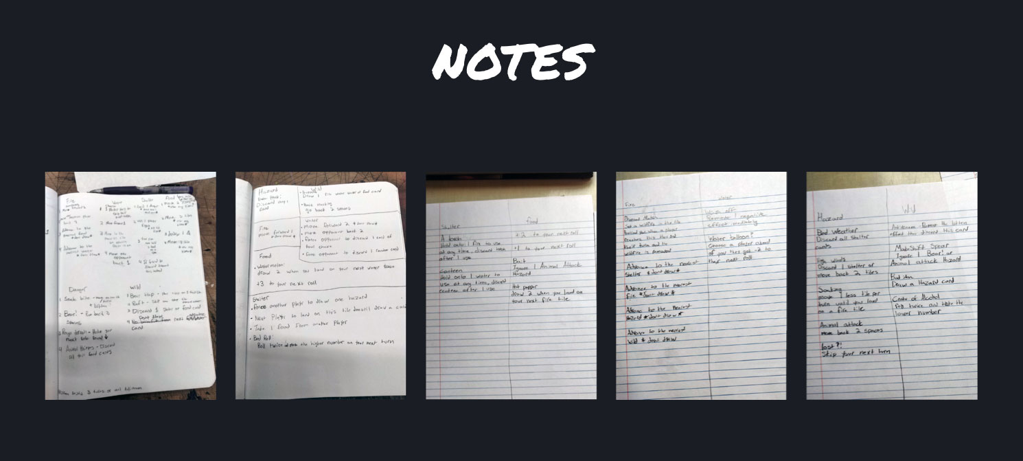
The image showcases the initial conceptual stage of the game’s development, where handwritten notes detail the fundamental ideas for each card type and their respective actions within the game. This phase represents the raw creative process, capturing the brainstorming and collaborative efforts of the team as they lay the groundwork for the game’s mechanics.
The notes, scribbled across several pages, seem to break down the various categories of cards and outline the specific roles or effects each card will have in the gameplay. This is where the core concepts are fleshed out, discussing potential strategies, hazards, and rewards that players might encounter. It’s a crucial stage where the team’s collective thoughts are pooled together, forming the blueprint from which the game will evolve.
These notes serve as the foundation for iterative design and development, guiding the subsequent stages of refinement and detailing that will eventually lead to the finished game. It’s a snapshot of creativity in action, with the scribbles, cross-outs, and annotations all part of the journey from concept to completion.
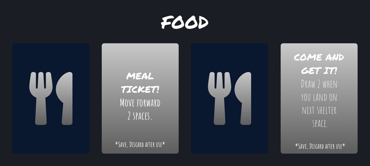
The “Food” card set employs a color palette that contrasts a deep navy background with light gray text boxes, using white for text. This contrast ensures readability while maintaining a sleek and modern aesthetic, aligning with the theme of essential sustenance in the game’s context.
The navy background suggests stability and reliability, much like the sustenance food provides in a survival scenario, which is the likely setting of the game. The gray text boxes serve as a neutral ground, allowing the white text to stand out, ensuring that the card’s function and instructions are immediately clear to the player.
Typography is another critical element here. The use of a sans-serif font gives the text a contemporary feel, in keeping with current design trends. It also aids legibility, which is crucial in a game setting where quick comprehension of card functions is necessary. The font size varies to hierarchically organize the information: larger for the card title, signaling its importance, and smaller for the card’s instructions and the footnote about its one-time use.
The chosen colors and typography work in tandem to create a user-friendly interface that is both aesthetically pleasing and functionally effective, enhancing the gaming experience without detracting from the fast pace of “Jungle Run.” The minimalist approach to design ensures that the focus remains on the gameplay, with the cards serving as tools to facilitate the game rather than overshadowing it.
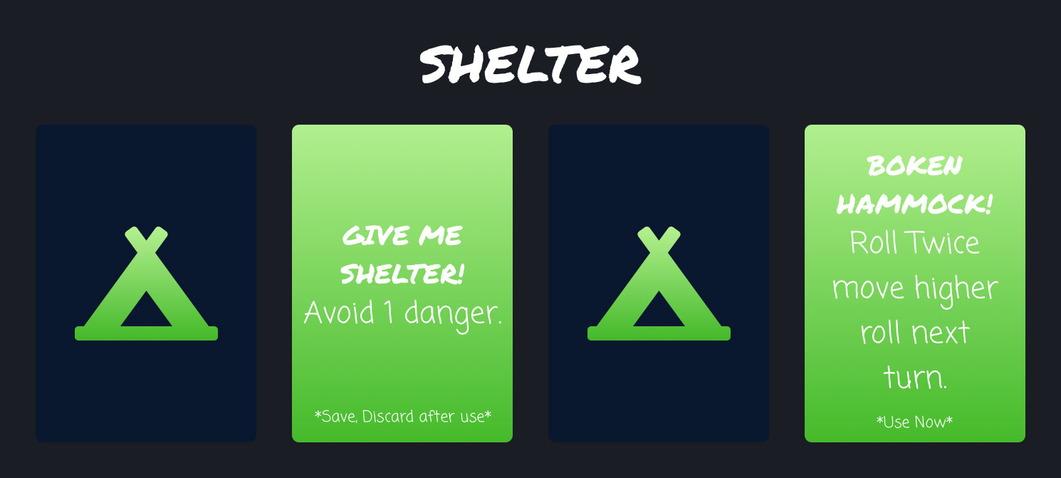
The “Shelter” card set is defined by a vivid color scheme and clear typography choices that reinforce the theme and functionality of the cards. The use of a luminous green hue on the central card immediately draws attention, symbolizing safety and rest—concepts commonly associated with the idea of shelter. This vibrant green stands out against the dark backdrop of the other cards, suggesting a beacon of safety in the ‘wilderness’ of the game.
The typography on the cards is casual and playful, mirroring the fun and adventurous spirit of “Jungle Run.” The varied use of uppercase and lowercase letters adds a dynamic rhythm to the text, mirroring the unpredictable nature of seeking shelter in a jungle environment. The instruction text is bold and simple, ensuring clarity and quick comprehension during gameplay.
The icons and text are well-balanced, providing a visual cue to the card’s purpose without overwhelming the design. This thoughtful use of color and type demonstrates a focus on user experience, making sure that the purpose of each card is immediately apparent and that players can easily distinguish the “Shelter” cards from others in the game.
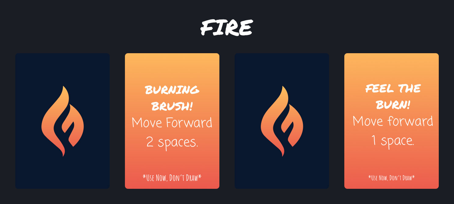
The “Fire” card set employs a gradient color scheme that transitions from a dark navy at the top to a fiery orange at the bottom, encapsulating the essence of fire, which is central to these cards. This color transition mimics the movement of flames, starting from the cooler, darker base to the hotter, brighter tips, effectively conveying the theme of fire, which symbolizes both danger and progress within the game.
The typography used on these cards is informal and energetic, with a handwritten style that adds a sense of urgency and spontaneity, resonating with the unpredictable nature of fire. The exclamatory phrases “BURNING BRUSH!” and “FEEL THE BURN!” are set in this lively font, grabbing the player’s attention and emphasizing the action-oriented gameplay that these cards provoke.
The choice to overlay the text directly onto the gradient background without any additional framing elements showcases confidence in the color scheme to provide sufficient contrast for readability. It also underscores the immediacy of fire’s impact in the game, with the cards serving as direct and immediate game-changers, much like an actual fire would alter the situation in a jungle-run scenario.
Overall, the design choices for the “Fire” card set create a visual hierarchy that allows players to quickly understand the cards’ significance and use them effectively during gameplay, enhancing the interactive and fast-paced nature of the game.
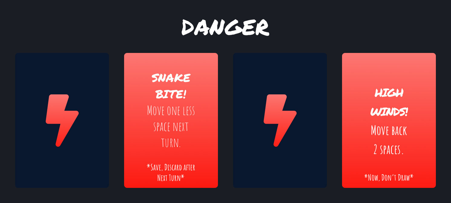
The “Danger” card set uses an arresting color gradient that transitions from a deep navy to a vivid red, a choice that instinctively signals caution and alertness. The red color, universally associated with danger and warning, is particularly apt for these cards as it visually communicates the potential threats players may encounter in the game.
The lightning bolt icon is a powerful symbol used to represent danger and is immediately recognizable, enhancing the player’s understanding of the card’s role without the need for extensive reading. This symbol’s consistency across the cards establishes a visual link within the set, unifying them under the theme of risk.
For typography, the choice of a handwritten style font adds an element of urgency and personal touch, akin to a hastily written warning. The font size is larger for the card titles, drawing attention to the type of danger, while the instructions are smaller yet still legible, ensuring players can quickly grasp what the card entails without it dominating the design.
The use of white text on the red gradient not only stands out due to the high contrast but also culturally reinforces the message of danger, as this color combination is often used in warning signs. This strategic use of color and type amplifies the theme of danger and the need for caution, aligning with the set’s purpose to introduce elements of risk and challenge into the gameplay.
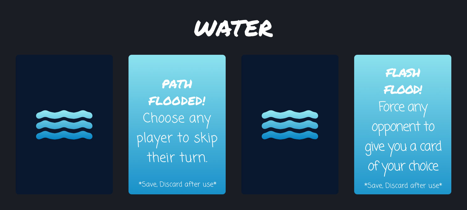
The “Water” card set is visually unified through the use of a cool-toned color palette that ranges from deep navy to lighter blue. This spectrum is reflective of water in various depths and reinforces the theme of the cards, which is centered around water-related events and actions within the game.
The central cards feature a gradient that transitions from dark to light, suggesting the movement from the depths of water rising to the surface, which could symbolize the sudden and unexpected events, like floods, that players must navigate in the game. The lightest shade of blue provides a background for the text, offering a clear contrast that aids readability while maintaining thematic consistency.
For the typography, a playful, handwritten font is used, which adds a sense of fluidity and movement. This choice mimics the properties of water – free-flowing and unpredictable, much like the events that the cards might trigger in the game. The casual font style also injects a sense of fun and spontaneity into the gameplay, inviting players to engage with the game’s ‘waters’ in a dynamic way.
Overall, the color choices and typography of the “Water” card set work together to create a thematic experience that is not only visually coherent but also enhances the narrative of unforeseen challenges and adventures that “Jungle Run” embodies.
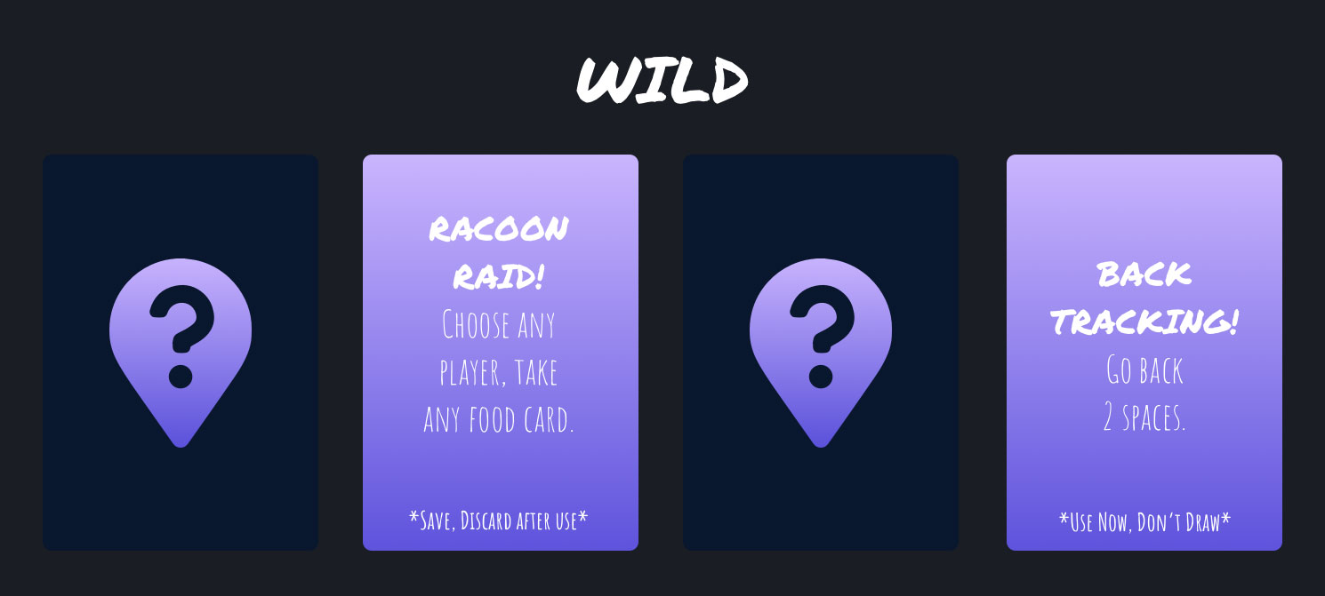
The “Wild” card set is visually characterized by a gradient of purples, conveying a sense of mystery and unpredictability which aligns with the ‘wild’ aspect of these cards. Purple, a color often associated with mystery and magic, aptly reflects the unknown outcomes that these cards represent in the game.
The question mark icon is central to the theme of the set, signifying the unforeseen and potentially game-changing effects these cards can have when played. Its prominent placement against the darker background makes it a focal point, reinforcing the sense of uncertainty these “Wild” cards bring to the table.
Typography for the card titles is playful and informal, with a handwritten style that emphasizes the spontaneous nature of ‘wild’ events within the game. The white text stands out against the gradient background, ensuring that the titles are easily legible, while the instructions are given in a smaller font, yet still maintaining readability.
The design choices for the “Wild” card set support the intended gameplay experience, where each card draw can lead to unexpected twists and turns, capturing the essence of a ‘wild’ adventure in the jungle. The color and typography work together to create a cohesive visual narrative that complements the game’s theme.
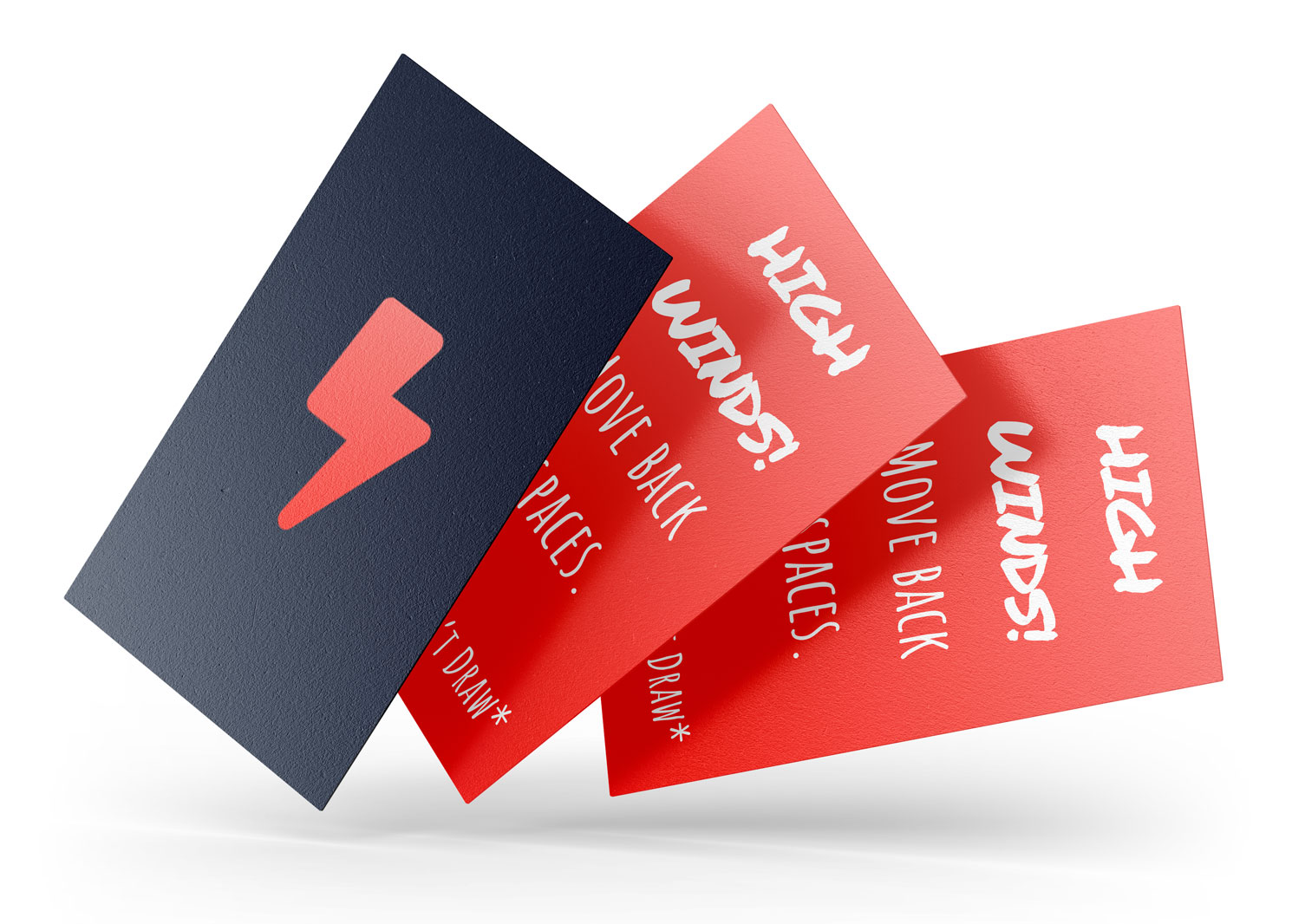
The image depicts a mock-up of game cards, providing a realistic view of how the cards would appear once printed on card stock. The physical representation of the cards offers a tangible sense of the game’s aesthetic and the feel of the materials in play.
The cards, fanned out to display their fronts, allow us to appreciate the contrast between the bold, hazard-symbol lightning bolt and the vibrant red of the danger-themed cards. The use of card stock suggests durability and a high-quality tactile experience for players, enhancing the overall engagement with the game.
This mock-up serves as an important step in the design process, bridging the gap between digital design and physical product. It offers a glimpse into the final user experience, showcasing how the cards are both a functional element of the game and a piece of the game’s visual identity. The card stock’s texture, weight, and feel in hand are all crucial aspects that contribute to the authenticity and immersion of the gameplay experience.
