Brief
When Verafi approached me they had a simple 3-4 page website. They wanted something a little more robust. I redesigned their website with a new theme that offered more options in the way of design. Since then it’s been an iterative process of adding pages, creating landing pages, designing their order wizard, I’ve even gotten a chance to dip my toes into designing for a marketing tool called Pardot.
Branding
The following is a collection of branding elements built out for the client. The branding includes a color palette, logo options for light and dark backgrounds, typography, and some UI options for buttons and active/inactive states.


Results
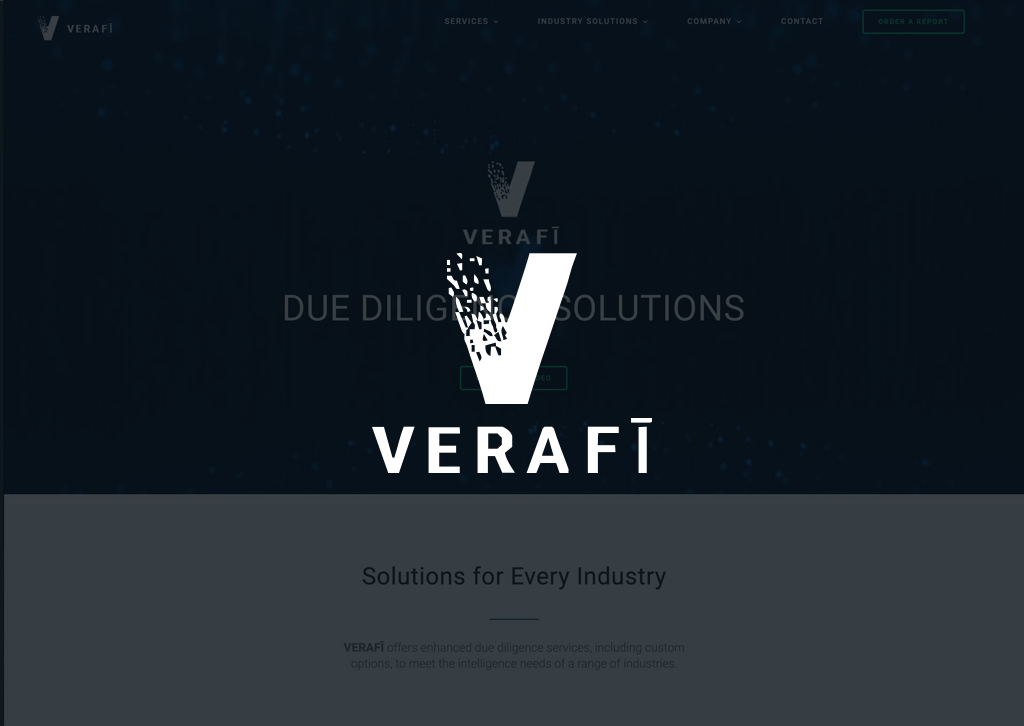
The resulting website was more sleek and clean, you start off up top with a video background. When they asked for their entire video to play in this header, I cautioned them that whatever text wise in the video was playing would take away from their messaging in the foreground of the slider. I talked them into a shorter clip that provided the perfect mix of moving texture and familiarity to the video that links in the header. From there we created all of the secondary pages which followed the same basic format. I introduced some iconography into the mix on their order wizard, I’ve been working it into the website as we make content changes to ensure consistency across their product offerings. The resulting website is sleek, simple, and is a perfect example of the identity of Verafi.
My work for Verafi is ongoing on a contractor basis, stay tuned as I update this space with more work as it evolves and morphs into newer, better work.
Process & Final Output