Brief
Envision a new era of US currency where the very essence of our times – a fusion of innovation, artistic creativity, and respect for trailblazing talents – is woven into the fabric of our banknotes. This was the vision at the heart of my project to reimagine the US Dollar. Fueled by a deep-seated interest in modern art and design, I ventured beyond conventional norms of currency aesthetics. My design pays homage to iconic figures in art and design, encapsulating their revolutionary contributions. This reimagined currency is more than a means of transaction; it’s a nod to our digital age and a celebration of artistic mastery. The concept I’ve developed reinvigorates the US Dollar, making it a contemporary emblem of the ingenious minds that continue to redefine our cultural landscape.
Results
Step into a realm where the boundaries of art, design, and state-of-the-art technology are pushed to forge a new definition of money. Driven by the transformative works of artistic giants and graphic design maestros such as Andy Warhol, Jean Michel Basquiat, Banksy, Paul Rand, George Odom, and Paula Scher, my project was an odyssey of reimagining the essence of US currency. This initiative was born from a quest to capture the spirit of our era, integrating groundbreaking technological features that complement the currency’s redesigned look. A secure chip embedded within each bill, armed with 128-bit encryption, acts as a formidable shield against forgery, reinforcing the currency’s security. In a revolutionary shift from traditional paper, I chose a durable synthetic polymer for the currency’s fabrication, ensuring resilience and a reduced ecological footprint. The culmination of this endeavor is a series of banknotes that not only mirrors the pulse of our digital age but also serves as a canvas for celebrating the genius of influential artists and designers. This currency is a vibrant embodiment of art and innovation, an icon of the new age, standing as proof of the limitless potential when technology and creativity collide.
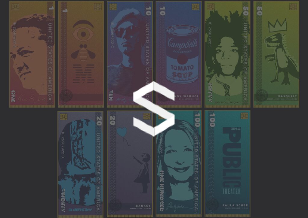
1, 5, 10 Design
1 Dollar Note – Paul Rand:
The $1 note celebrates the legacy of Paul Rand, a towering figure in graphic design. The note is imbued with an earthy orange hue, symbolizing Rand’s influence as the foundation of modern graphic design. The front of the note features Rand’s contemplative profile, while the reverse side includes the iconic Eye-Bee-M symbol, showcasing his seminal logo work. The integration of braille along the edge signifies inclusiveness and the inclusion of high-tech elements like what appears to be a secure chip suggests a commitment to currency security. The overall design honors Rand’s minimalist aesthetic and his philosophy of design’s functionality and simplicity.
5 Dollar Note – Georg Olden:
The $5 note is a dynamic homage to Georg Olden, a pivotal figure in the evolution of broadcast design and advertising. Bathed in a vivid teal that suggests innovation and vision, the note reflects the era of television’s golden age and the burgeoning world of advertising in which Olden was a trailblazer. On the front, Olden’s confident and forward-looking portrait is featured, indicative of his role as a leader in graphic design for television. The reverse side honors his design of the prestigious Clio Award, signifying his lasting impact on the advertising industry. The inclusion of braille along the side of the note is a nod to inclusivity, a principle undoubtedly valued in Olden’s pioneering work in a field that shapes public perception. The note’s design subtly incorporates modern security features, perhaps represented by the chip-like pattern, which symbolizes the intersection of creativity and innovation—a fitting tribute to Olden’s legacy in television and advertising design.
10 Dollar Note – Andy Warhol:
The $10 note is a fitting homage to Andy Warhol, the pope of pop art. It is drenched in a rich purple, a color often associated with creativity and imagination, which aptly reflects Warhol’s vibrant works. The front of the note features a stylized portrait of Warhol, characterized by his signature shades and shaggy hair, while the reverse side displays his iconic Campbell’s Soup Can, encapsulating his philosophy that mundane objects could be high art. The braille feature reiterates the design’s inclusive approach and the modern security features embedded within the note speak to the innovative spirit of Warhol’s artistry.
Each note in the series is a testament to the transformative power of design and art. The thoughtful inclusion of braille and advanced security features not only enhances the functionality of the currency but also aligns with the forward-thinking nature of the individuals it honors. The distinct color palettes and graphic elements chosen for each note reflect the unique style and contributions of the featured artists, making the currency a moving celebration of artistic vision and a practical application of design excellence.

20, 50, 100 Design
This image displays a series of US currency notes in denominations of 20, 50, and 100, each thoughtfully redesigned to celebrate prominent figures in the arts and design. Each note is characterized by a distinct color scheme and visual elements that echo the signature styles of the artists featured.
20 Dollar Note – Banksy:
The $20 note spotlights street artist Banksy, with a backdrop of his iconic stenciled imagery in shades of blue, conveying the subversive and mysterious nature of his work. The purple foreground features the famous image of a girl with a balloon, a motif that has become synonymous with Banksy’s commentary on innocence and loss.
50 Dollar Note – Jean-Michel Basquiat:
On the $50 note, the bold green color palette pays homage to Jean-Michel Basquiat, reflecting his vibrant, raw artistic energy. The portrait captures Basquiat’s intense gaze, surrounded by motifs representative of his graffiti art and neo-expressionist style. The crown, a recurrent symbol in Basquiat’s work, is prominently featured, symbolizing his impact on the art world.
100 Dollar Note – Paula Scher:
The $100 note honors graphic designer and painter Paula Scher. The teal backdrop represents her association with the Public Theater and her revolutionary approach to graphic design. The use of bold, clean lines and typographic elements reflects Scher’s influence on design and her role in defining the visual language of contemporary culture.
The incorporation of braille on each note continues the theme of accessibility and inclusivity, ensuring that the currency is user-friendly for all. The advanced security features, potentially signified by the chip-like designs, speak to a modern approach to anti-counterfeiting measures.
Each note is a microcosm of the artist’s contributions, capturing their essence through color, composition, and iconography. These design decisions craft a narrative that goes beyond the monetary value of the notes, transforming them into educational and inspirational pieces that celebrate the enduring legacy of these cultural icons. The currency becomes a vessel for storytelling, combining visual artistry with technological innovation to create a currency fit for a diverse and digitally-advanced society.

Money Stack Mockup
This image showcases a conceptual stack of $50 currency notes, each featuring the bold likeness of artist Jean-Michel Basquiat. The notes are arranged in a traditional bank bundle, secured by a paper currency strap that bears Basquiat’s name, reinforcing the theme of the design.
The color scheme of the notes is a striking gradient of green tones, providing a fresh take on the traditional green color of US currency. Basquiat’s portrait is stylized in a manner reminiscent of his own artistic style, with a spontaneous and expressive line quality that captures the essence of his work.
The design of the currency includes Basquiat’s name and the denomination in a clear, bold typeface, ensuring easy readability. The inclusion of the braille pattern along the bottom edge of each note indicates a consideration for the visually impaired, and the simulation of a security chip suggests modern anti-counterfeiting measures.
The artistic presentation of the stack of notes as a whole is not just a display of wealth but also a celebration of Basquiat’s contribution to the art world, serving as a metaphor for the value of art and creativity in society. This image reflects a currency design that is as much a piece of art as it is a functional object, blurring the lines between financial and cultural worth.